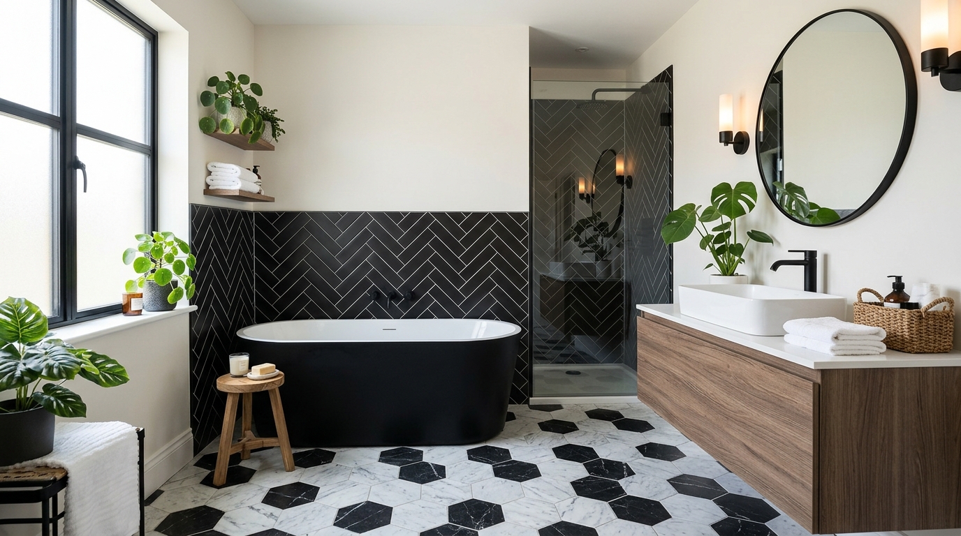
I used to think black and white bathrooms were the “safe” choice for a remodel. Boy, was I wrong. Most of them end up looking like a referee’s jersey or a cheap 1950s diner—not the vibe I’m going for.
You want high-end drama, not a floor that makes you feel like a pawn on a giant chess board.
I’ve spent way too much money on tile samples to let you make the same mistakes I did. It’s about balance. If you go too heavy on the white, it’s a hospital. Too much black? You’re living in a cave. Let’s find that sweet spot.
Stop using white grout unless you love scrubbing
I learned this the hard way after scrubbing my shower floor with a toothbrush at 2 AM. White grout is a total trap. It looks crisp and “Pinterest-perfect” for about four days, then the mildew and soap scum turn it that sickly yellow color.
Seriously. Just don’t do it.
Go for a dark gray or even a true black grout. It hides the grime and makes your tile patterns actually pop. It gives the room a bit of “edge” that white grout just can’t touch. Plus, you won’t lose your mind trying to keep it clean.
Try the half-wall tile look for a change
There’s something about tiling only halfway up the wall—usually called a wainscot—that just hits different. It stops the room from feeling like a sterile laboratory. I usually top mine with a simple black pencil trim.
It’s like eyeliner for your bathroom walls.
The best part? You can paint the top half of the wall a soft, matte white. It softens the whole space. My sister did this in her tiny powder room and it’s the only reason that room doesn’t feel like a literal closet. It adds texture without being “too much.”
Brass faucets make the whole room look richer
Chrome is fine if you want your bathroom to look like a doctor’s office. But brass? That’s the secret sauce. It adds this weirdly specific warmth that stops the black and white from feeling “dead.”
I swapped my old silver fixtures for unlacquered brass last year.
The transformation was wild. The room went from “boring rental” to “I definitely have my life together” in about twenty minutes. It’s a tiny change that carries a lot of weight. If you’re worried about it looking dated, go for a brushed finish instead of the super shiny stuff.
Oversized floor tiles beat the tiny checkerboard look
Everyone reaches for those tiny 1-inch hexagon tiles because they think it’s “classic.” It’s not classic; it’s a headache. Those tiny tiles mean you have a million grout lines to keep track of.
I prefer the massive stuff.
I’m talking 24×24 or even 12×24 slate-look tiles. Huge tiles make a small bathroom look freaking massive. It’s a total mind trick. It creates a solid, heavy base for the room that feels grounded and expensive. Small tiles just look busy and chaotic. No thanks.
Go dark on the ceiling if you want high drama
I painted my guest bath ceiling a deep, moody charcoal—basically black—and my mother-in-law literally gasped when she walked in. She thought I was turning the house into a tomb. But here’s the secret: it actually makes the room feel taller.
A dark ceiling hides those weird popcorn textures or crooked drywall lines that drive me crazy. It pulls your eyes upward and makes the whole space feel expensive.
Just do it.
Natural wood vanities keep things from feeling sterile
If you go full “black-and-white-everything,” your bathroom will eventually start to feel like a cold, clinical hospital wing. I learned this the hard way after staring at my white-tiled walls for six months. It felt dead.
I swapped the basic white cabinet for a chunky white oak vanity with a raw, grainy finish. Instant fix. The wood grain breaks up the “chess board” vibe and makes the room feel like humans actually live there.
Nature beats tile every time.
Pick one wall for a wild geometric pattern
Don’t plaster that busy, dizzying tile on every single wall—you’ll get a massive headache before you even finish brushing your teeth. I tried a full accent wall in a crazy starburst pattern behind my mirror and it changed the entire vibe of the house.
It’s a lot. But it’s the good kind of a lot.
Stick to one spot. Maybe just the shower back wall or the area right behind the sink. It keeps the room from looking like a boring 1950s diner.
The black-bottomed tub is a total showstopper
I once spent three days sanding down a vintage cast-iron clawfoot tub just so I could paint the bottom matte black. My hands were vibrating for a week afterward from the sander.
Was it worth it? Absolutely.
A white tub is fine, I guess. But a black-bottomed tub looks like it belongs in a fancy hotel in London rather than a regular house. It’s heavy, it’s moody, and—best of all—it hides the dust bunnies that gather underneath.
Matte black hardware just feels more modern
Chrome is a total nightmare. I hate cleaning it, and I hate how it shows every single crusty water spot from my kids’ messy hands. Matte black hardware is the only way to go if you value your sanity.
It looks expensive even if you bought it for fifty bucks on a whim.
Just a heads-up though—don’t buy the super cheap stuff or the finish will flake off in six months like a bad sunburn. Spend the extra $30 for the decent brands. It matters.
Mix your textures instead of just colors
If everything in the room has the same smooth, shiny finish, it’s going to look like a boring hospital hallway. My first reno was a mess because I bought the cheapest, glossiest white tile I could find. It felt like a sterile lab. Don’t do that.
Mix it up—throw in a rough slate floor next to a glossy subway tile wall. The light hits them differently. It’s weird, but it works.
Get a matte black sink and put it against a bumpy, handmade-look backsplash. You want people to actually want to touch the walls. If it looks too perfect, it looks cheap.
Industrial grid shower doors look like art
Glass doors are a pain to keep clean, but these black grid ones—sometimes called Crittall-style—are worth the squeegee life. Seriously. They turn your shower into a piece of furniture instead of just a wet box.
I’ve seen people try to DIY this look with electrical tape. Please, don’t. Just buy the real metal frame. It makes the whole space feel anchored and solid.
It’s the best way to get that “expensive hotel” vibe without actually staying in one.
Floating black vanities give you more floor space
I hate cleaning around the legs of a traditional vanity. It’s where the dust bunnies go to die. Mounting a heavy black cabinet right to the wall makes the room feel massive because you can see the floor going all the way to the back.
It looks sleek. Just make sure your contractor actually knows how to hit the studs—I’ve seen one of these rip right off the drywall because someone got lazy. Scary stuff.
Plus, you can hide a scale or some slippers underneath. Out of sight, out of mind.
Vintage rugs bring some soul into the room
Stop buying those fuzzy, lint-trapping bath mats from big-box stores. They look cheap after three washes. I switched to a skinny, worn-out vintage runner in my master bath and it changed everything.
The deep reds and browns in an old rug keep the black and white from looking too “stark.” Plus, wool is naturally water-resistant. Who knew?
Just use a good rug pad. You don’t want to go sliding across the floor like a cartoon character when you step out of the shower.
Striped towels are a cheap way to test the look
Not ready to rip out your floor? I get it. Buy a set of thick, black-and-white striped towels instead.
It’s a cheap way to see if you actually like the high-contrast vibe before you spend five grand on a contractor who won’t show up on time anyway. If the stripes make you dizzy, you saved yourself a lot of money.
I keep a stack of these in my guest bath. Everyone asks where I got them. (Target. They’re from Target.)
Add some tall greenery to break up the lines
I put a huge Snake Plant in my last B&W bathroom because the vibe was getting way too close to a high-end dentist office. It felt stiff. My tiles were so sharp and perfect that it actually felt weird to walk in there with messy hair—like I was ruining the look. One tall, leafy monster in the corner fixed that immediately.
Go for something with big, floppy leaves. A Bird of Paradise is my go-to because it looks expensive but it’s actually pretty hard to kill if you have a window. You need those weird, wiggly shapes to mess up the “perfect” look of your straight grout lines and square walls.
Seriously. Just get one big plant. It makes the room look like a person actually lives there instead of a robot.
Conclusion
Look, you don’t need to turn your house into a giant chess set to make this work. Stick to the basics. Keep your grout dark so you don’t lose your mind cleaning it—trust me on that one—and throw in some wood or brass to keep things from feeling like a cold hospital room.
Pick three ideas from this list. Do not try to do all seventeen at once. If you do, your bathroom will look like a design magazine threw up in there, which is never the goal. (Unless you like living in a showroom, I guess).
Start with the towels or a funky vintage rug. See how it feels. You can always paint the bottom of the tub black next weekend if you’re still feeling brave.