I Used to Hate Pink, Then This Happened
I spent years telling anyone who’d listen that pink bathrooms were a crime against humanity. My aunt had this carpeted pink disaster from 1984 that smelled like old potpourri—it literally scarred me for life. Then I walked into a boutique hotel in Austin and saw a salmon-hued wet room that looked… expensive?
I stood there for ten minutes just staring at the wall.
It wasn’t that sugary, sweet pink that makes you want to brush your teeth. It was moody. It was cool. I realized right then that I didn’t actually hate the color—I just hated how people were using it. If you do it wrong, you’re living in a Pepto Bismol bottle. If you do it right, your house feels like a sanctuary.
Swap the Boring Chrome for Matte Black Hardware
Chrome is for dental offices. If you pair pink tiles with shiny silver hardware, you’re just recreating your grandma’s guest bath from the Eisenhower administration. Don’t do that to yourself.
Matte black is the “cool older sibling” of finishes. It grounds the room. It says, “I’m an adult who likes color, but I also own a leather jacket.” Seriously, the contrast is everything.
I swapped my old faucet for a black industrial-looking one last Tuesday and it changed the entire vibe. It stops the pink from feeling too “precious.” You want a bit of grit to balance out the softness. Trust me.
Real Talk: Terrazzo Floors Are a Total Vibe
Let’s be honest: white grout is a nightmare to clean. I ripped out my plain white tiles three months ago because I was tired of scrubbing them with a toothbrush on my hands and knees. Terrazzo floors are the ultimate cheat code for lazy people who want to look fancy.
You get these tiny chunks of marble and glass that hide every single stray hair or speck of dust.
It looks like confetti, but in a “I have a designer on speed dial” kind of way. I went with a slab that had tiny flecks of salmon and grey. It’s busy enough to be interesting but neutral enough that you won’t get a headache looking at it while you’re brushing your teeth. Best money I ever spent.
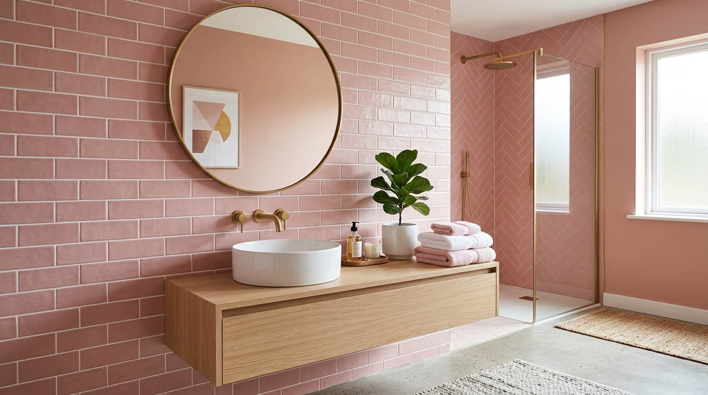
Choose Dusty Rose Over That Ugly Pepto Bismol Shade
There is a specific shade of pink that looks like a bottle of stomach medicine. Avoid it like the plague. If the paint chip makes you want to barf, put it back on the shelf and walk away.
You want “Dusty Rose” or even a “Muted Terracotta-Pink.” It’s basically a neutral. It’s the color of a sunset after a really long day.
It feels soft—not like a Barbie dream house that exploded in your face. I painted my small powder room in a shade called “Setting Plaster” and my husband didn’t even realize it was pink for three days. He just thought the room looked “warm.” That’s the goal.
Stack Your Tiles Vertically Like a Professional
Most people default to that “subway tile” look where everything is horizontal and staggered. It’s fine, I guess. It’s safe. But if you want your bathroom to actually feel tall and not like a cramped box? Flip those suckers on their side.
Stack them straight up. No staggering.
It creates these long, vertical lines that make your ceiling feel ten feet higher than it actually is. It’s a cheap trick—literally doesn’t cost an extra dime in materials—but man, it works. It looks like something you’d see in a high-end spa in Copenhagen rather than a suburban flip.
Go Overboard with Moody Floral Wallpaper
Stop thinking about those tiny, “ditsy” prints that belong in a dollhouse. You want the big stuff—the massive, dark-background florals that look like a moody Dutch oil painting from the 1600s. I put a deep plum and oversized pink peony print in my guest bath last year and it changed the whole energy of the house.
It’s weirdly comforting.
The dark colors keep the pink from feeling too “baby girl.” Plus, a busy pattern is a lifesaver for hiding those annoying water spots or slightly crooked DIY tile jobs. (Ask me how I know.)
Pink Meets Cold, Hard Concrete for a Brutalist Twist
Pink can get real “Barbie Dreamhouse” real fast if you aren’t careful. My secret weapon to stop the sweetness? Raw, grey concrete. It sounds a bit harsh, but the mix is actually incredible.
I’m talking about a heavy concrete trough sink or even those micro-cement walls that feel like a cold sidewalk. It’s basically the interior design version of wearing a heavy leather jacket over a delicate silk dress. It just works—no questions asked.
Throw in a Neon Sign Just Because You Can
Look, your bathroom shouldn’t feel like a museum. I bought a flickering pink neon sign for my powder room on a total whim (and maybe after two glasses of wine). It was the best $150 I ever spent on a renovation.
It gives off this hazy, club-like glow that makes everyone look way better in the mirror at 2 AM.
Seriously. If you’re worried about it being “too much,” just put it on a dimmer switch.
Walnut Vanities Make the Whole Space Look Grown Up
If you pair white cabinets with pink walls, you are basically living inside a giant cupcake. Don’t do that. Switch to walnut instead. The deep, oily tones in the wood grain ground the pink and make the whole room feel like a fancy hotel in Copenhagen.
I spent way too much on a custom walnut floating vanity for my last flip, and it’s the only reason that house sold so fast.
It’s the “adult” way to do pink.
High-Gloss Finishes That Definitely Don’t Feel Dated
Everyone is obsessed with matte everything right now, but they’re mostly wrong. High-gloss pink tiles—the kind that have that “wet look”—make a tiny, windowless bathroom feel twice the size because they bounce light like a disco ball.
It feels expensive.
Also, it’s way easier to wipe down when you accidentally explode your dry shampoo everywhere. Trust me on that one.
Brass Is Actually Your Best Friend in a Pink Room
I spent way too much money on brushed nickel before I realized it made my pink walls look like a cold hospital wing. Seriously. It was depressing. Brass is the fix. It adds this warmth that makes the pink feel intentional rather than like a mistake.
Go for unlacquered brass if you’re okay with it getting a bit “dirty” looking over time. That patina is what makes it look expensive.
If you use chrome, you’re basically asking for your bathroom to look like a 1992 remodel. Don’t do that to yourself.
Pair It with Dark Forest Green to Stop the Cuteness
If your bathroom looks like a five-year-old’s bedroom, you need dark green. It kills the sugary vibe immediately.
I once painted a vanity in a deep forest shade against blush tiles—best decision of my life. It went from Barbie’s playhouse to a moody boutique hotel in about four hours. Green makes the pink look like a “design choice” rather than a “gender reveal party” gone wrong.
It just works.
Modern Pink Checkerboard Tile Is the New Cool
Forget the 1950s diner look. Pink and cream checkerboard is where it’s at right now.
I saw a DIYer on Reddit do this with matte tiles and it looked incredible—way better than the shiny stuff. It’s a bit of a flex. It says, “I’m cool enough to pull off a pattern that should be ugly, but isn’t.” Keep the grout thin, though. Thick grout lines will ruin the whole thing and make it look like a pizza place.
Try the Half-Wall Paint Trick to Save Some Cash
Tiles are expensive. Like, “why am I paying this much for baked clay?” expensive.
If you want the pink look but your bank account says no, just paint the top half of the wall. Use a crisp white on the bottom—or even some cheap beadboard if you’re feeling fancy. This creates a horizontal line that actually makes your ceilings look higher.
It’s a trick I stole from a staging pro I used to work with. It works every single time.
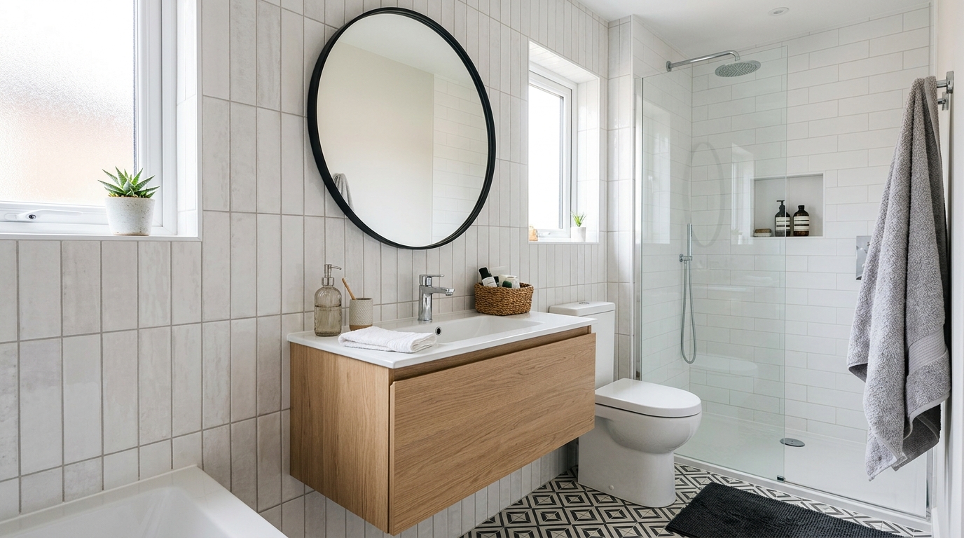
Oversized Circular Mirrors Fix Everything Instantly
Why do people buy tiny mirrors? I don’t get it.
A massive circular mirror over a pink vanity breaks up all those sharp, boxy edges. It bounces the light around so the pink doesn’t feel like it’s closing in on you.
Also? It hides the fact that your tile job might be slightly crooked. Trust me on that one. Large mirrors are basically the “filter” of the interior design world.
Plaster Finishes for an Organic and Earthy Mood
I’m obsessed with the “raw” look of lime wash or Tadelakt right now. It gets rid of that flat, suburban nursery vibe immediately. When I did this in my last reno, the contractor thought I was nuts for wanting “uneven” walls, but once the pink plaster dried—it looked like a high-end spa in the middle of a desert.
The depth is unreal. Every time you shower, the steam makes the walls look slightly different. It’s earthy. It’s weirdly grounding.
Forget about being perfect.
Conclusion: Just Paint the Wall Already
I spent nearly three hundred bucks on samples and sat in my dark bathroom for weeks trying to “feel the energy” of different mauves. Total waste of time. Just pick a shade that doesn’t make you cringe and buy the gallon.
If it looks bad—which it won’t—you can just cover it up next weekend. But you’ll probably end up loving how much it pisses off your boring neighbors.
Just do it. Seriously.