I spent way too much money on paint samples this year. My bedroom looked like a Smurf exploded for a while, and honestly? Most “Pinterest-perfect” blue rooms are a total lie once you actually try to sleep in them.
I went through 14 different setups because I’m obsessed—and maybe a little bit crazy.
Some of these ideas made me feel like I was at a high-end spa. Others made me feel like I was living in a cold, damp cave. Here is the unfiltered truth about what worked and what made me want to scream.
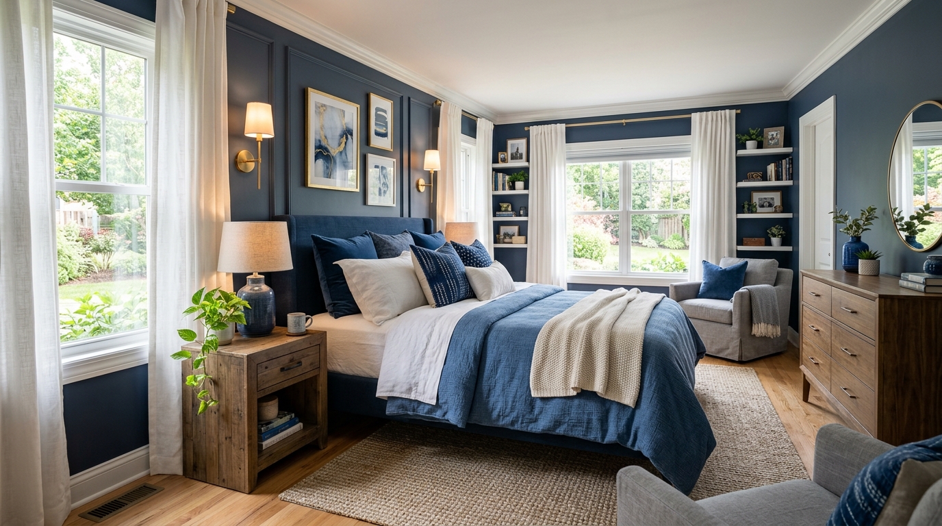
Blue Bedroom Ideas: Why I Painted My Main Wall Navy
Everyone told me navy would make the room feel like a tiny coffin. They were wrong. I used a deep, moody shade and it turned out to be a giant hug for my walls.
It hides the scuffs from my vacuum cleaner, too.
But here is the catch—if you don’t have enough natural light, navy just looks like a black hole. I had to swap my old yellow light bulbs for something cooler just to make the blue actually “show up” against my floorboards. It was a whole ordeal involving a ladder and a lot of swearing.
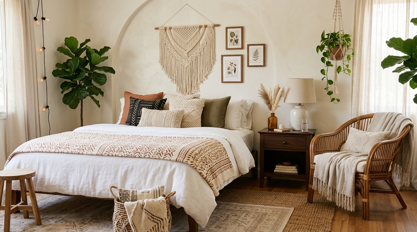
Why Powder Blue Bedding Was a Huge Mistake for Me
I thought powder blue would look “ethereal” and light. Instead, my bed looked like a cot in a stuffy clinic. Or maybe a nursery for a baby I don’t even have.
It was just… sad.
Every single coffee drip from my morning disasters showed up like a neon sign on that pale fabric. If you aren’t a perfectly clean person who eats zero snacks in bed, stay far away from light blue linens. They are a trap.
That Time I Painted My Bedroom Ceiling Sky Blue
This was a 2 a.m. decision fueled by too much caffeine and a “why not” attitude. Painting a ceiling is a physical nightmare—prepare for neck cramps that last a week—but sky blue is a total cheat code for rooms with low ceilings.
It’s weird. You stop seeing the “top” of the room. It just feels… open.
Just don’t go too bright. If you pick a blue that’s too saturated, you’ll wake up feeling like you’re trapped inside a Pixar movie intro. Keep it dusty. Keep it muted. Trust me on this one.
How I Layered Different Blue Textures Without It Looking Messy
Mixing blues is hard because if the undertones are off, the whole room feels “wrong” in a way you can’t quite explain. The trick I stumbled onto? Change the fabric, not just the shade.
I threw a chunky navy knit blanket over some thin, slate blue sheets.
It works because your eyes see the “feel” of the fabric before they notice the colors aren’t a perfect match. It makes the space look like I actually have my life together—even if my closet is a disaster zone. Velvet pillows are the secret weapon here. They catch the light differently than cotton, which hides the fact that you’re mixing three different versions of the same color.
Teal Nightstands: The Riskiest Choice That Actually Worked
I bought these weirdly bright teal nightstands from a thrift store—mostly because I was tired of everything looking “safe.” At first, they looked like a neon mistake against my dark navy walls. I almost repainted them that same night.
Then I realized the punchy color stopped the room from looking like a sad, dark cave. It’s that weird pop that makes a guest go, “Oh, where’d you get those?” instead of just ignoring the furniture.
Sometimes you just need one piece of furniture to scream a little bit.
My Honest Review of Slate Blue Linen Sheets
I dropped way too much money on slate blue linen sheets. For the first week, I felt like I was sleeping on a burlap sack. Seriously. They were scratchy and the color looked like a wet sidewalk under my yellow bedroom lights.
Don’t expect soft clouds right away with linen. After about five washes and a month of tossing and turning, they finally got that “worn-in” vibe I see on Pinterest. It’s a total commitment.
The color is a shapeshifter—blue in the morning, gray at night.
Pairing Gold Knobs with Deep Blue Furniture
If your blue furniture looks cheap, it’s probably the handles. I had this navy dresser that looked like a basic IKEA piece until I slapped some heavy, brushed gold knobs on it. It’s the easiest way to fake a “designer” look without actually knowing what you’re doing.
I found these chunky unlacquered brass pulls that get a bit of a dark patina over time. It makes the whole room feel expensive—even if the dresser is held together by wood glue and prayers.
Just stay away from the super shiny, fake-looking gold. It looks like a pirate’s treasure chest.
The Struggle with Dusty Blue Trim and White Walls
Dusty blue trim seemed like a “mood board” dream. In reality? It made my bedroom look like a nursery for a very confused toddler. The white walls were way too bright, and the blue trim ended up looking like a mistake I couldn’t afford to fix for months.
I spent four days taping everything off just to realize I hated the contrast. It makes the room feel small and choppy.
If you’re going to do blue trim, the walls need to be an off-white or a light gray. Pure white just shouts at you.
Why Denim Rugs are Surprisingly Great for Blue Bedrooms
Denim rugs sound like a terrible leftover idea from the early 2000s. I bought one anyway. It’s basically bulletproof.
My dog treats it like a wrestling mat and the weave hasn’t pulled once. Plus, the different shades of blue in the thread hide every single piece of lint I’m too lazy to vacuum.
It’s not soft, per se. But it’s the only rug I’ve owned that doesn’t look “tired” after six months of heavy foot traffic. Seriously.
Dark Blue Blackout Curtains Changed How I Sleep
I used to wake up at 5:14 AM every single morning because the sun would hit my face like a spotlight. It was brutal. I finally ditched my flimsy white blinds and grabbed some heavy, navy velvet blackout curtains—the kind that feel like they belong in an old theater.
If you do this, make sure your curtain rod is actually bolted into a stud. These things are heavy. Like, “rip the drywall right out” heavy.
The difference in my sleep was instant. It’s not just about the darkness, though that’s great for my afternoon naps (don’t judge). The dark blue fabric actually absorbs the heat from the window better than the cheap plastic ones did. My room feels five degrees cooler and looks about ten times more expensive.
Coastal Blue Patterns That Do Not Look Like a Cheap Hotel
We’ve all seen those “beachy” rooms that look like a $40-a-night motel in Florida. You know the ones—stiff striped comforters and anchors everywhere. It’s tacky. I avoided that by sticking to block prints and Shibori patterns instead of basic stripes.
Focus on the texture of the fabric.
I found this hand-dyed indigo duvet cover that has these slightly “off” white lines. Because it isn’t perfect, it looks like something I picked up at a boutique market rather than a big-box store. It gives off those relaxed, “I live near the water” vibes without the weird seashell pillows.
Using Steel Blue to Make My Tiny Bedroom Look Massive
My guest bedroom is basically a closet with a window. I originally painted it stark white because that’s what everyone says to do for small spaces. Total lie. It just looked cramped and dingy.
I repainted it in a muted steel blue—think of a stormy sky right before it pours.
Because steel blue has those heavy gray undertones, the walls seem to recede. It’s a total mind trick. It makes the corners of the room disappear into the shadows, making the whole space feel way airier than it actually is.
It’s weird, but darker, cooler tones can actually open a room up more than white ever could.
Cobalt Blue Lampshades for a Weirdly Cool Glow
I found a pair of vintage cobalt blue glass lampshades at a garage sale for ten bucks. My partner thought they were hideous. “It’s going to look like a dorm room,” they said.
They were wrong.
When you put a warm-toned LED bulb inside a deep blue shade, the light that spills out isn’t actually blue. It’s this soft, moody, almost moonlight-colored glow. It’s the perfect “winding down” light for when I’m reading in bed and don’t want the harshness of a normal lamp hitting my eyes.
The Total Blue Monochromatic Experiment That Failed
I got a little overconfident last March. I decided I was going to do the “color drenching” thing where everything—the walls, the trim, the ceiling, and even the radiator—is the exact same shade of medium blue.
It was a disaster.
I felt like I was living inside a giant bottle of Gatorade. There was zero contrast, so I kept stubbing my toe on my bed frame because I couldn’t tell where the floor ended and the furniture began.
Unless you have massive windows and 12-foot ceilings, skip the total monochromatic look. You need at least some wood tones or white trim to break things up, or you’ll end up feeling totally claustrophobic like I did. I repainted the ceiling white within forty-eight hours. My back still hurts from that mistake.
Why Blue Walls and Natural Wood Tones Just Make Sense
Blue can get cold fast. I’m talking “sitting inside a walk-in freezer” cold.
I didn’t realize how much I needed wood until I dragged my old, scratched oak dresser against that navy wall. The warmth from the grain stops the blue from feeling sterile—it’s like the room finally took a deep breath. I’ve tried matching furniture before, but it looked like a cheap showroom.
Seriously, don’t overthink the finish. Mixed woods actually look better with blue anyway.
Conclusion
Fourteen experiments later and my bank account is screaming at me.
Some of these ideas—looking at you, monochromatic blue—were a total dumpster fire. But that’s the point of DIY, right? You mess up until you find the one shade that doesn’t make you want to rip the drywall out. My room finally feels like my own space and not some Pinterest board I’m just visiting.
I’m weirdly proud of this blue mess. Go grab a brush.