
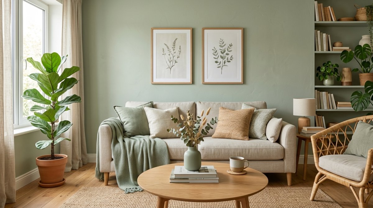
I spent twelve months staring at fifty shades of green. Seriously. My husband thought I was losing my mind. Every time we went to the hardware store, I walked out with ten more tiny paper squares. I wanted that “cool girl” Pinterest vibe but I ended up making a lot of expensive messes first.
Sage green looks easy. It isn’t.
If you don’t want your living room to feel like a doctor’s office from 1994, you need to hear what I figured out the hard way.
My first huge mistake: picking a ‘minty’ sage
I bought three gallons of what I thought was the perfect shade. I painted the whole back wall before I realized the truth. My living room looked like a giant tube of toothpaste.
It was way too bright.
True sage has a whole lot of gray in it. If the sample looks “fun” or “fresh” in the store, put it back on the shelf. You want a color that looks almost muddy on the card. I’m telling you, the “ugly” colors on the swatch always look the best once they’re actually on your walls.
Why undertones will drive you crazy if you aren’t careful
One morning the walls looked like a beautiful forest. By 4 PM, they looked like a dirty lemon. Why? Yellow undertones are a nightmare.
Lighting is a jerk.
If your room faces north, your sage will turn blue-gray and feel freezing cold. If you have southern light, that green is going to glow like a radioactive lime. I had to repaint my hallway twice because I didn’t check how the sun hit it at noon. Always paint a huge square on the wall—not just a tiny speck—and watch it for 24 hours before you commit.
Texture is the only thing stopping your room from looking flat
Flat walls plus flat furniture equals a boring room. It just does.
I had a sage wall and a gray polyester couch and it felt like sitting inside a cardboard box. It was depressing.
You need stuff that feels bumpy. Think chunky knit blankets, a rough jute rug, or even those ribbed ceramic vases. I threw a heavy linen pillow on my chair and suddenly the green didn’t look so “blah” anymore. It’s about layers. If everything is smooth, the room will feel dead.
The dark wood trick that makes the green look expensive
Light oak is fine, but it makes sage look a bit too “nursery” for my taste. I wanted it to look like a fancy hotel in London.
I swapped my cheap pine coffee table for a dark walnut one. Boom.
The contrast makes the green pop. Dark wood—think espresso or deep mahogany—gives the color some weight so it doesn’t just float away. It’s the difference between a room that looks “fine” and a room that looks like you actually have money in the bank. Go dark or go home.
Stay away from silver—gold is the only answer
I spent forty bucks on silver cabinet pulls because I thought they looked “clean.” Big mistake. Huge. The silver made my sage walls look like a cold, sterile hospital wing from the nineties.
Sage needs heat to look expensive.
You have to go with gold, brass, or even a weird champagne bronze. These warm metals “fight” the cool grey tones in the green and make the whole room feel like a cozy library instead of a doctor’s office. Trust me, skip the chrome.
I almost gave up until I tried black accents
My living room looked like a giant bowl of mushy peas for about three months. It was just… soft. Too soft. There was no “pop” or “edge” to anything, and I seriously considered repainting the whole thing white.
Then I bought a cheap black iron floor lamp.
Suddenly, the sage didn’t look like a nursery color anymore. It looked sophisticated. You need that “black anchor”—whether it’s a picture frame, a thin coffee table leg, or even just a chunky black vase—to give the green some backbone. Without it, the room just floats away into Boring-Land.
Rugs are a nightmare to pair with sage
I bought and returned three rugs before I stopped crying. Gray rugs are the worst—they turn your sage walls into a muddy, depressing mess. Pure white rugs make the room look like a Pinterest fail because the contrast is too loud.
I finally found the “secret sauce.”
Look for a rug with “rust” or “terracotta” tones in it. Or, if you’re lazy like me, just get a chunky jute rug. The natural tan fibers make the green look like it’s part of nature rather than just a bucket of paint you bought at Home Depot.
The truth about the green velvet sofa hype
Instagram lied to us. Well, partially. I bought the green velvet sofa because every single “aesthetic” home on my feed had one, and yes, it looks stunning in photos.
But here is the reality: it’s a lint magnet.
If you have a cat, or a dog, or even a husband who wears fuzzy socks, that sofa will look “dusty” within twenty-four hours. I spend more time with a lint roller in my hand than I do actually watching TV. It’s a high-maintenance relationship—beautiful to look at, but a total pain to live with.
How my windows changed the color every single hour
My west-facing window is a dirty liar. At 8:00 AM, my walls look like a perfect, soft eucalyptus leaf. By 4:00 PM, the direct sun hits them and they turn into a weird, vibrating neon lime that makes me want to scream.
Paint a massive swatch and watch it.
Don’t just look at it once. Look at it when it’s raining. Look at it when you have your shitty overhead lights on. Sage is a total shapeshifter, and if you don’t test it at night, you might end up living inside a giant glowing glow-stick. Seriously.
Painting the trim sage was a total game-changer
I spent months staring at my white baseboards and thinking they looked… off. Like a hospital vibe. It made the green walls look like a cheap nursery. Then I just grabbed the brush and painted the trim the exact same color as the walls. Total mood shift.
Seriously, the room grew three feet taller.
The trick is using a satin finish on the wood while keeping the walls dead matte. It creates this subtle shadow play that looks like you hired an expensive designer from some fancy magazine—even if you’re just drinking boxed wine on the floor.
Conclusion
After twelve months of living in a green box, I can tell you it’s worth the stress. It’s calming as hell. Just please—for the love of your sanity—test your samples on every single wall before you commit.
Don’t let a tiny swatch lie to you.
If the paint looks like a sugary mojito at 8 AM, scrap it and start over. You want a room that feels like a forest at dusk, not a bowl of melted mint ice cream. Go buy the samples. Now.


