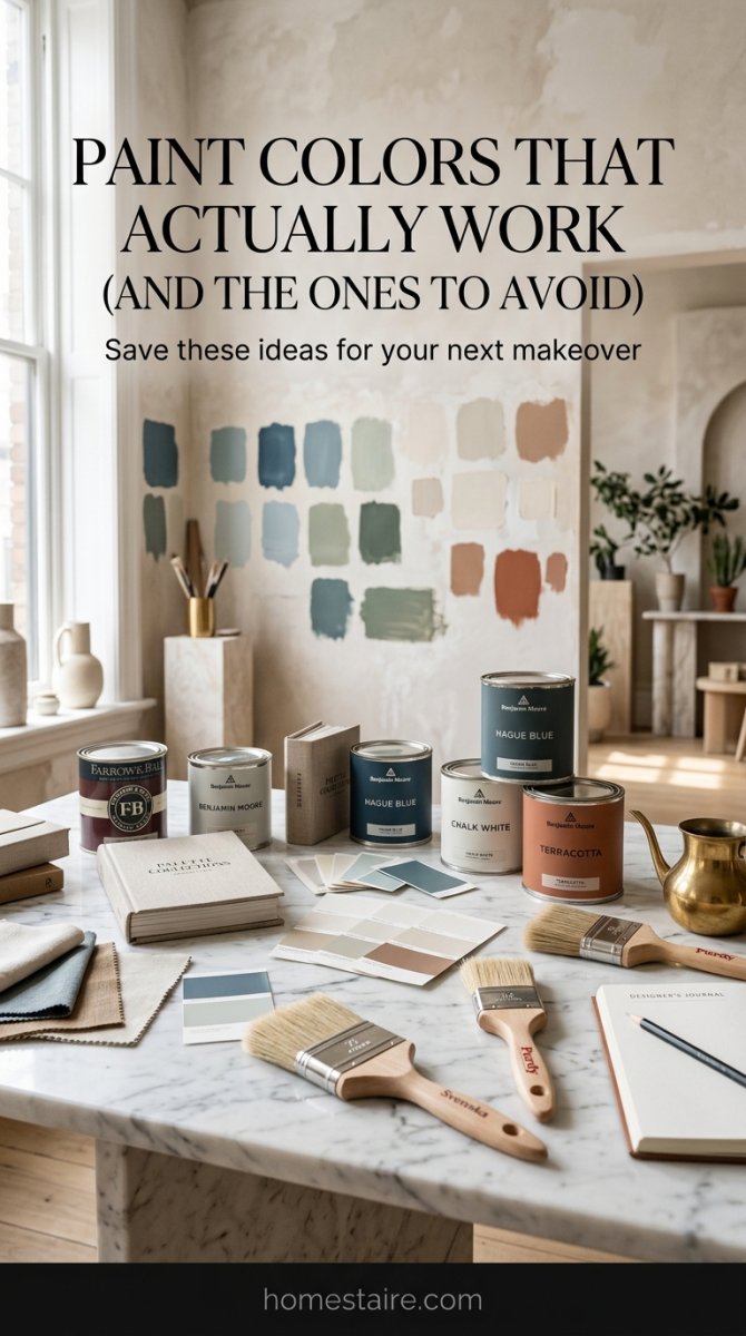
I spent three weeks living under plastic drop cloths and smelling like chemical fumes just to figure out what actually looks good on a wall. Most Pinterest boards are lying to you—they use professional studio lights that make mud-brown look like “warm espresso,” and then you paint your actual wall and it looks like a basement. I’m $1,400 deep in sample pots and ruined brushes.
It was a total mess.
I’m talking about those nights where you’re staring at a patch of “eggshell” that looks suspiciously like highlighter yellow. I did the work, made the mistakes, and cried a little bit over a gallon of spilled navy paint so you don’t have to. Here is the honest truth about what these colors actually do to a room once the sun goes down.
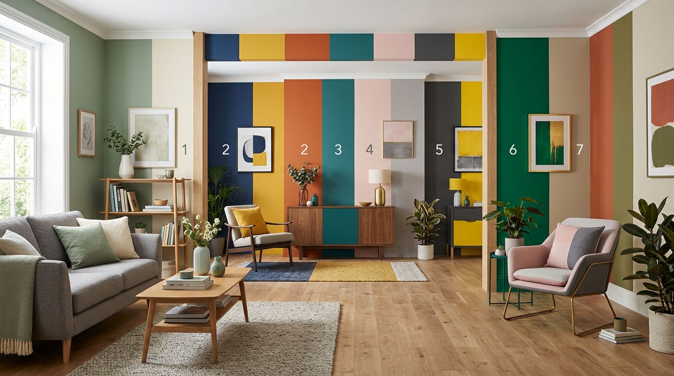
Sage Green and Terracotta (The vibe I actually kept)
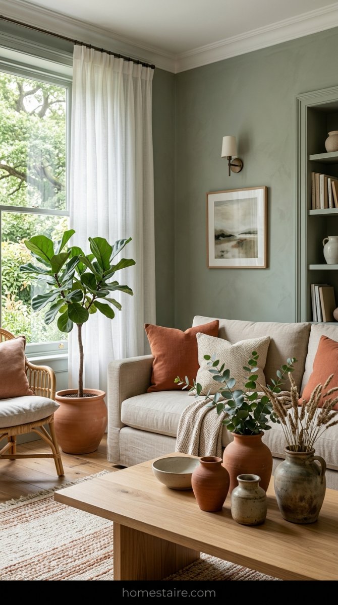
I thought this would look like a 1990s taco shop. It didn’t. It’s the only combo that didn’t make me want to rip my hair out after three days of staring at it. The sage is muted—almost gray in the shadows—which is the secret to making it not look like a literal forest.
It feels like a spa.
Then I threw in some terracotta pillows and a big clay vase I found at a garage sale. The warmth from the orange-red tones stops the green from feeling too “cold” or hospital-like. It’s grounded. My living room finally feels like a place where you can actually take a nap without feeling like the walls are screaming at you.
Navy Blue and Mustard Yellow (It felt like a cheap showroom)

I hated this. It felt like a budget furniture store showroom or a high school locker room. You see it on Instagram and think “wow, so bold!” but in reality? It’s just loud and annoying.
The navy blue swallowed all the light in the room (even with the big windows). Every time I sat on my couch, I felt like I was waiting for a bus in a very dark tunnel. Plus, the mustard yellow accents just looked like… well, mustard. Everywhere. Avoid this unless you want your house to feel like a sports bar for people who don’t actually like sports.
Charcoal Gray and Blush Pink (Stop doing this to your house)

Please just stop. I tried to make it work—I really did—but it looks like a nursery for a very sad adult. The charcoal is way too heavy for the “cutesy” pink. It feels dated. Like, “I just bought my first condo in 2015” dated.
My husband said it looked like a bottle of Pepto-Bismol exploded in a coal mine.
He wasn’t wrong. The pink picks up the blue undertones in the gray and everything ends up looking like a bruised thumb. If you want a moody room, go all in on a dark color. Don’t try to “soften” it with pink. It doesn’t work. It just looks confused.
Forest Green and Cognac Leather (The “old money” vibe)
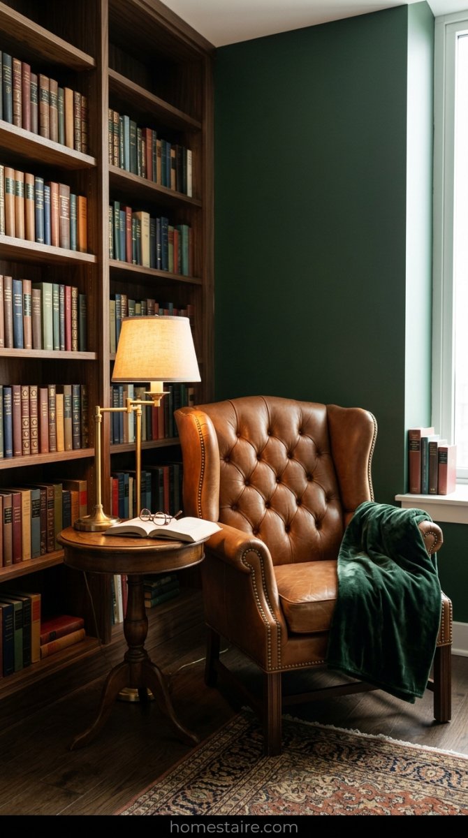
If you want to feel like you own a library and a horse, do this. I painted one wall a deep, dark forest green and dragged in an old leather chair I found on Facebook Marketplace. Instant class. It’s moody and dark, but the leather brings in all the warmth you need.
I felt fancy just sitting there. Seriously.
The trick is the leather—it has to be that rich, orangey-brown cognac color. If you use a dark brown leather, the whole room turns into a black hole. But that specific orange-meets-green combo? It looks expensive. It looks like you have a 401k and you know how to fix a leaking sink.
Greige and Matte Black (Honestly just felt boring)
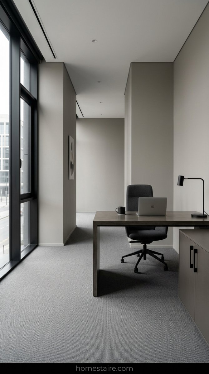
I fell for the Pinterest trap. I really did. Greige walls plus matte black hardware sounded sophisticated—like a high-end loft in a city I can’t afford.
It wasn’t. It was just… flat. My living room ended up looking like a waiting room for a dentist who charges way too much for a cleaning. No soul. Just gray and sadness.
It’s a safe choice, sure. But safe is another word for “I have no personality.” Unless you want to feel like you’re living inside a spreadsheet, skip the greige.
Teal and Burnt Orange (A lot of chaos for one room)
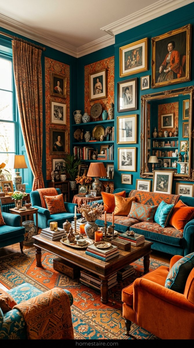
My eyes actually hurt after two days of this. I wanted that bold, “I’m an artist” look, but teal and orange together? It’s loud. Like, aggressively loud.
It felt like a sports bar for a team that doesn’t exist.
Unless you want your house to scream at you every time you walk in for coffee, skip it. I repainted this one the fastest. My wife hated it. I hated it. Even the dog looked stressed out by the walls.
Cream and Soft Gold (How to look rich for fifty bucks)
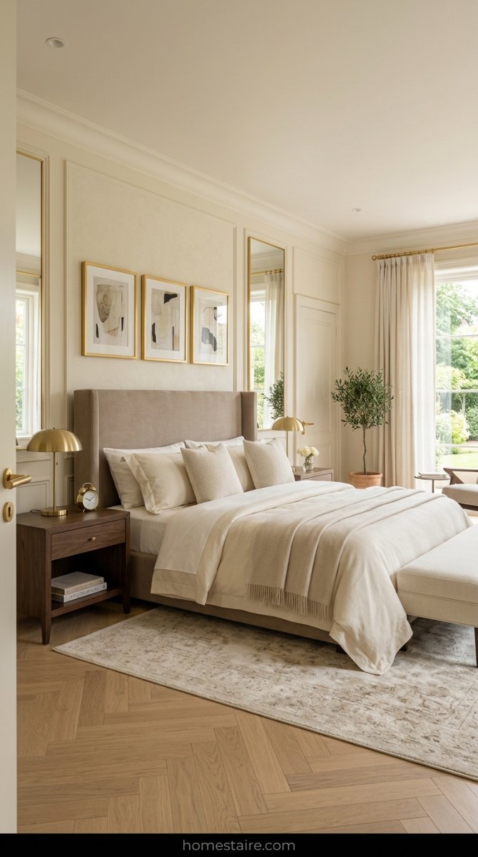
I found a half-used can of “Antique White” in the clearance bin at the hardware store and decided to wing it. I added some cheap gold spray-painted frames I found at a garage sale.
Magic. Absolute magic.
It makes the whole space feel like a fancy hotel suite where you get free slippers. You don’t need a million dollars. You just need a warm cream that doesn’t look like melted butter and some shiny bits. It’s the “stealth wealth” of paint jobs. Seriously.
Why your lightbulbs keep ruining your wall color
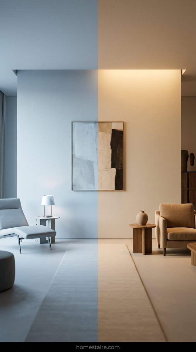
Stop blaming the paint. It’s those cheap “Daylight” bulbs you bought in bulk at the warehouse store. They turn every nice, warm gray into a disgusting shade of bruised purple.
I spent $80 on a gallon of designer paint only for it to look like a morgue at night. I was ready to sue the paint company. Then I swapped the bulbs.
Switch to 3000K bulbs. That’s the secret. It’s the sweet spot between “cold hospital white” and “grandma’s dusty yellow lamp.” Everything looks better under 3000K.
The ceiling paint mistake that made my room feel tiny
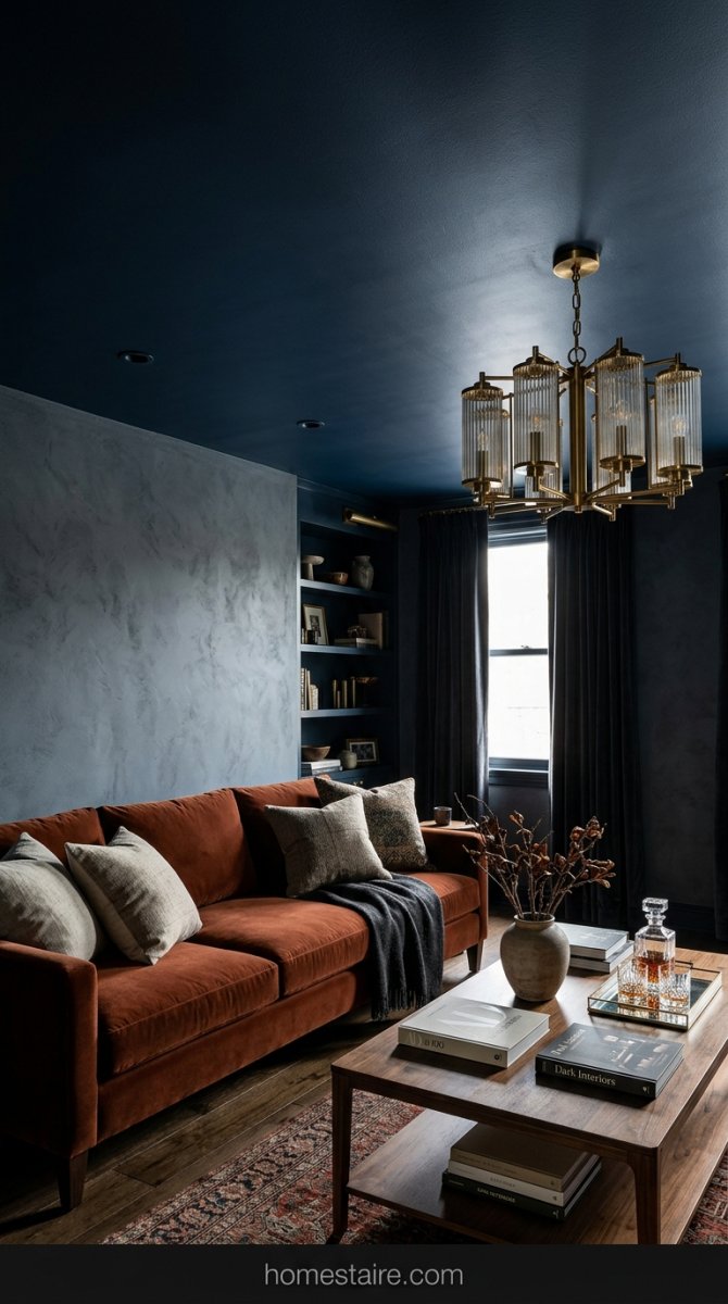
I tried that “moody ceiling” trend I saw on some home design blog. Big mistake. Huge.
I painted the ceiling a deep navy while the walls were a light blue. I felt like the sky was falling on my head every time I walked in. The room shrunk instantly. My 9-foot ceilings suddenly felt like I could touch them if I jumped.
If you have normal-sized ceilings, just stick to a soft white. My head felt like it was being squished by a dark cloud. It was totally claustrophobic and I spent my entire Saturday painting it back to white.
Stop trying to match your rug to your walls exactly

I used to think I was being smart by matching my rug to the exact shade of my sage green walls. It was a disaster. My living room ended up looking like a giant bowl of split pea soup—just one big, blurry blob of green with zero personality.
Contrast is your best friend. If your walls are a deep color, go for a rug that’s three shades lighter or a totally different (but vibes-matching) neutral. You want the floor to look like a floor, not an extension of the drywall.
Seriously. Stop buying rugs that “blend in.”
Why dark paint made my small living room look like a cave
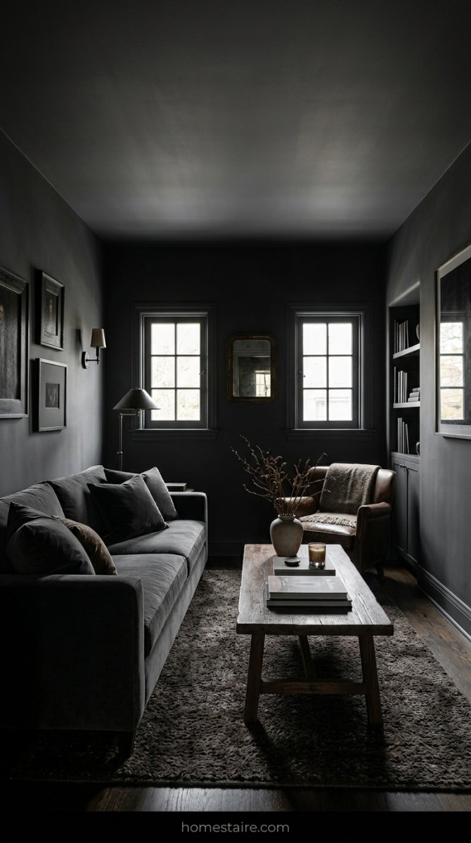
Everyone on Pinterest says dark colors make a room “cozy.” They lied to me. I painted my tiny 10×12 living room a moody charcoal gray and I instantly felt like I was trapped in a damp basement—even at noon with the curtains wide open.
My lamps couldn’t fight off the shadows. It felt heavy, like the walls were literally leaning in to tell me a secret I didn’t want to hear. Dark colors need massive windows and high ceilings to work. If you’re working with a cramped space and one tiny window, stick to the lighter stuff or you’ll be miserable by Tuesday.
It was a total vibe killer.
My weird trick for testing colors without painting the wall

Stop painting those little patches directly on your wall. It’s a huge pain to sand those down later—I’ve got “ghost squares” under my current paint that drive me crazy every time the sun hits them.
Instead, I go to the dollar store and buy a stack of white poster boards. Paint the whole board, let it dry, and then tape it up with blue painter’s tape. I move those boards around to different corners at 10 AM, 3 PM, and 9 PM. You’ll be shocked at how a “perfect” beige looks like dirty dishwater once the sun goes down and your crappy floor lamp kicks in.
How different fabrics can fix a boring paint job
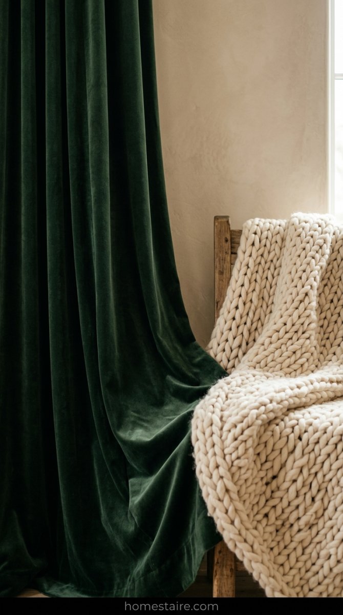
Sometimes the paint isn’t the problem—it’s the stuff in front of it. I once had this “builder beige” room that looked like a doctor’s waiting office. I was about to spend $400 on new paint until I realized everything in the room was the same flat, boring cotton texture.
I threw a chunky knit wool blanket over the sofa and swapped my cotton curtains for heavy velvet ones. Boom. The room suddenly looked intentional. Texture is basically paint you can touch—it adds shadows and highlights that make a boring wall color look way more expensive than it actually is.
Shiny fabrics reflect light; fuzzy ones swallow it. Use both.
Why I finally quit buying the cheapest paint brand
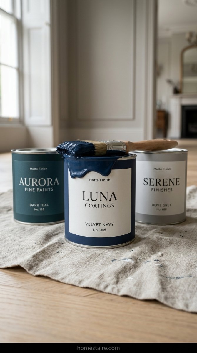
I spent $25 on a “bargain” gallon of paint once because I was being a cheapskate. I ended up needing four coats to cover a pale yellow wall. By the time I bought the extra cans, I’d spent more money and double the time—plus my wrists were killing me.
The cheap stuff is basically tinted water. It drips everywhere and the finish looks patchy no matter how good you are with a roller. Now I just bite the bullet and buy the top-shelf stuff. It covers in one or two coats and doesn’t smell like a chemical factory for a week straight.
Lesson learned: your time is worth more than the $30 you save at the hardware store.
Keeping the color flow going into your kitchen area
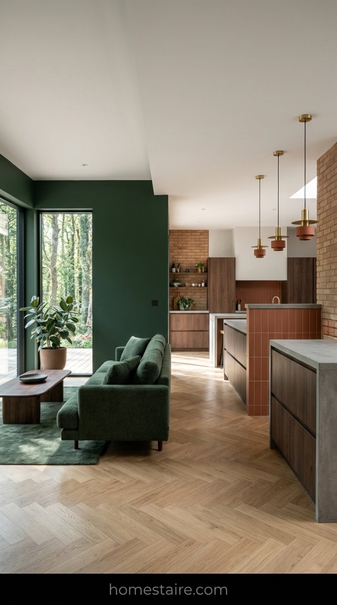
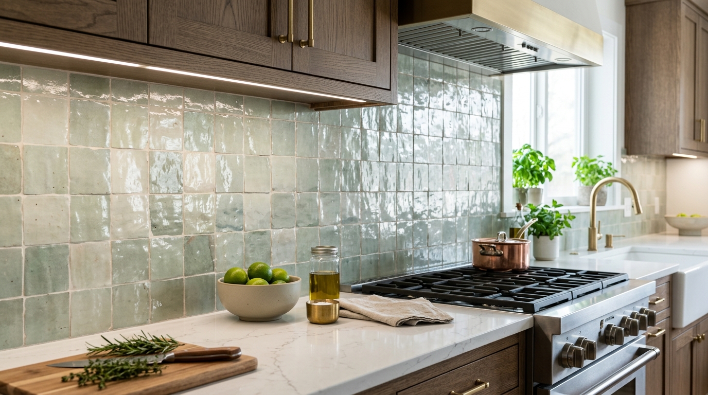
Most people treat their kitchen like a separate planet—don’t do that. I learned the hard way when I went from a cozy forest green living room to a kitchen that looked like a sterile hospital wing. It was jarring. To fix it, I dragged a bit of that green into the kitchen through a runner rug and some ceramic jars on the counter.
It’s all about the sightlines. Stand in your living room and look toward the stove. If the colors scream at each other, your brain will itch. I promise.
Don’t overthink it. Just pick one “bridge” color (like that terracotta I mentioned earlier) and sprinkle it around both rooms. It makes your house feel like a human actually planned it.
Conclusion
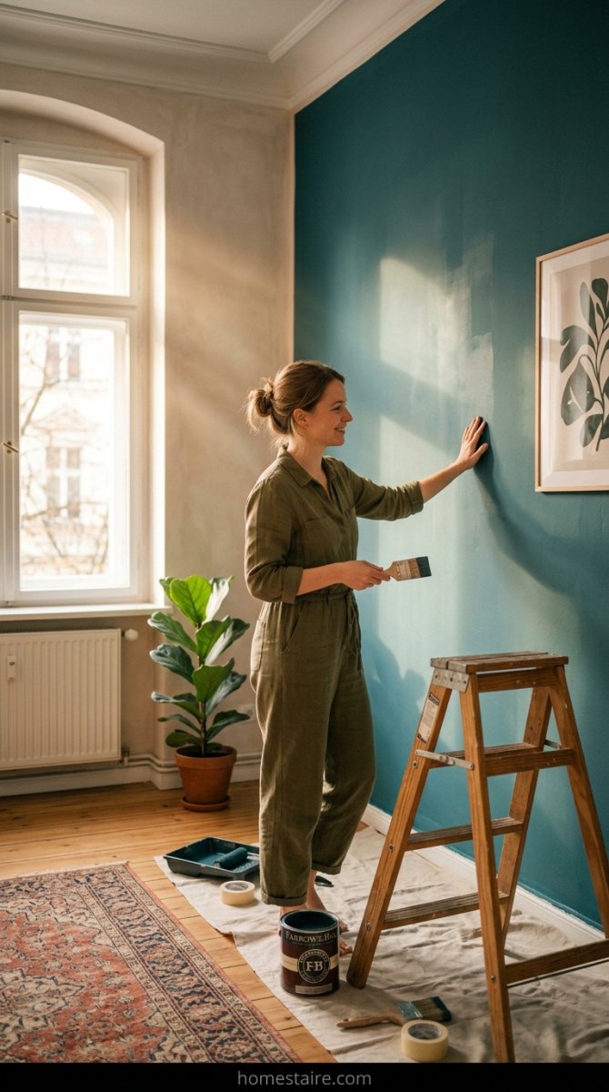
Paint is cheap. Well, maybe not the $80-a-can stuff I started buying, but it’s cheaper than a new sofa. Don’t get stuck in your own head because some influencer told you gray is dead. If you love gray, paint it gray.
I spent way too much time crying over swatches only to realize I’m the only one looking at them. Your house isn’t a museum. It’s where you eat pizza and watch Netflix.
Just go buy a brush. Seriously. Stop reading and go do it.