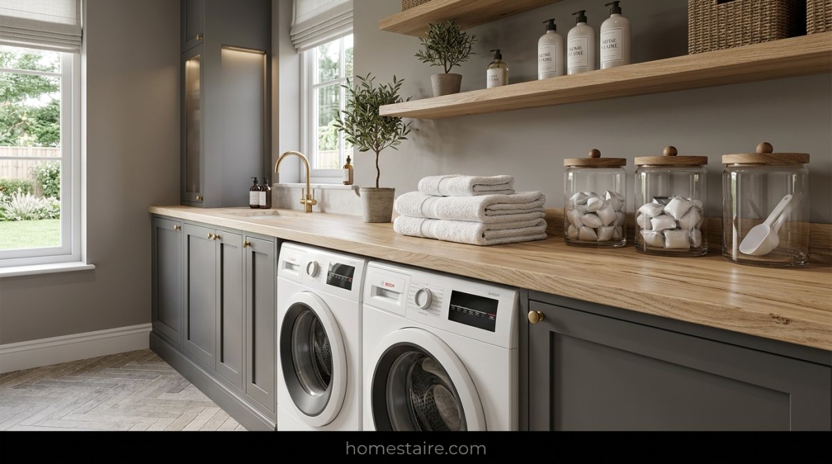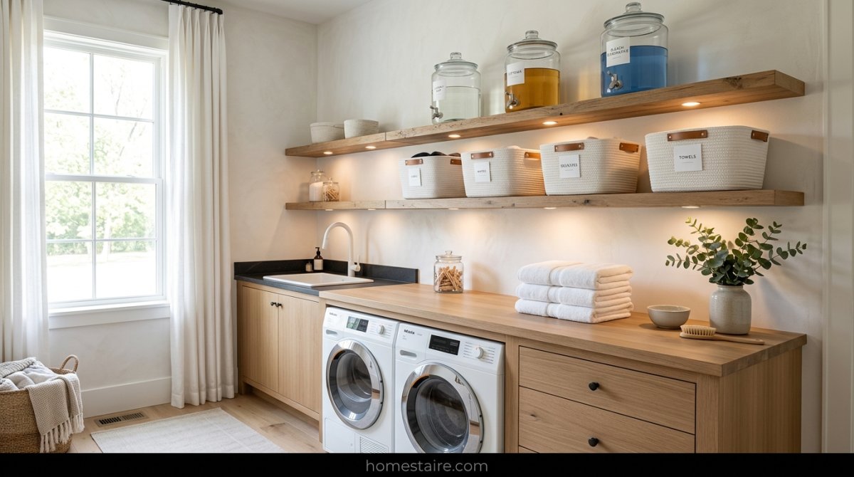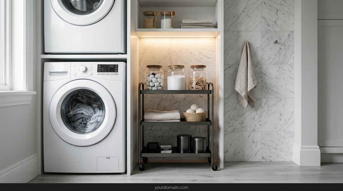


I’m not exactly proud to admit this, but I spent four whole weekends—and way too much money on those tiny sample pots—staring at wet paint in a windowless closet. My laundry room is basically a glorified shoebox tucked behind the kitchen. Every “pro” tip I read online told me to go light and bright.
They were wrong.
I’ve lived through the trauma of “Hospital White” and “Dirty Dishwater Beige.” After stripping the baseboards for the fourth time (my DIY-hating husband almost lost it), I finally figured out which shades actually stop a tiny room from feeling like a damp dungeon.
Why Pure White Usually Makes Tiny Laundry Rooms Look Like a Hospital Basement
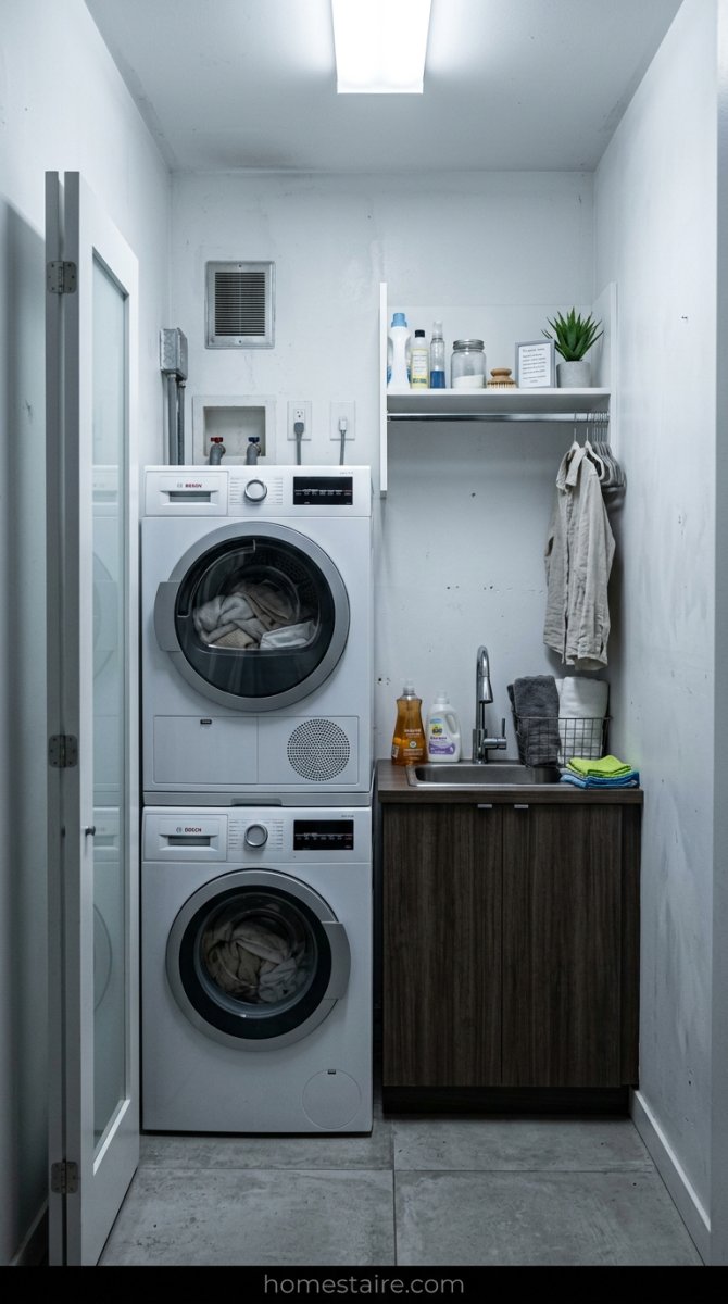
Everyone tells you that white makes a space feel bigger. That’s a total lie if you don’t have a massive window. In a small, dark laundry room, pure white doesn’t look crisp—it looks like a morgue.
Without natural sunlight to bounce around, white paint just picks up the shadows from the corners. It turns into this weird, sickly gray color that makes me feel like I should be scrubbing floors in a Victorian workhouse. It’s cold. It’s sterile.
It makes every piece of lint on the floor look ten times more annoying.
The Smoky Navy That Actually Made My Windowless Room Feel Infinite
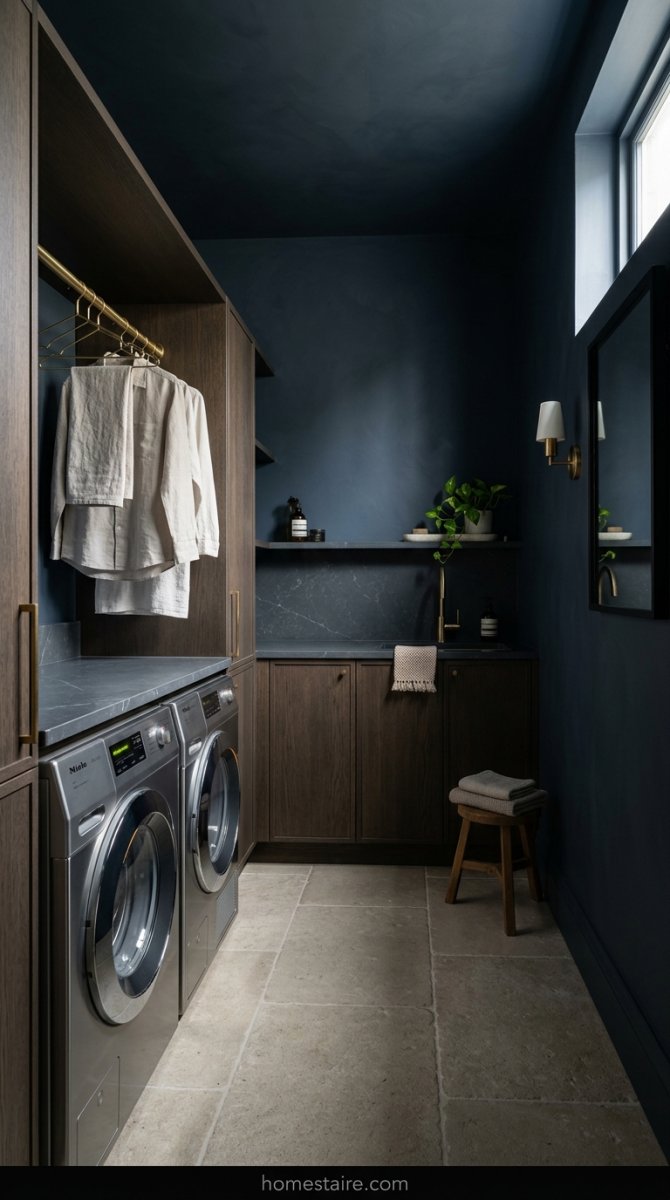
I was terrified of dark paint. I thought putting a deep, smoky navy in a 5×5 room would make it feel like a coffin. But here is the weird thing—dark colors actually make walls recede.
Because the corners of the room are dark, your eyes can’t quite tell where the wall ends and the ceiling begins. It’s a total mind trick. I went with a navy that has a lot of gray in it (think of a stormy sky right before a massive downpour).
The room felt bigger. Seriously.
Stop Buying Greige if Your Laundry Area Has Zero Natural Light
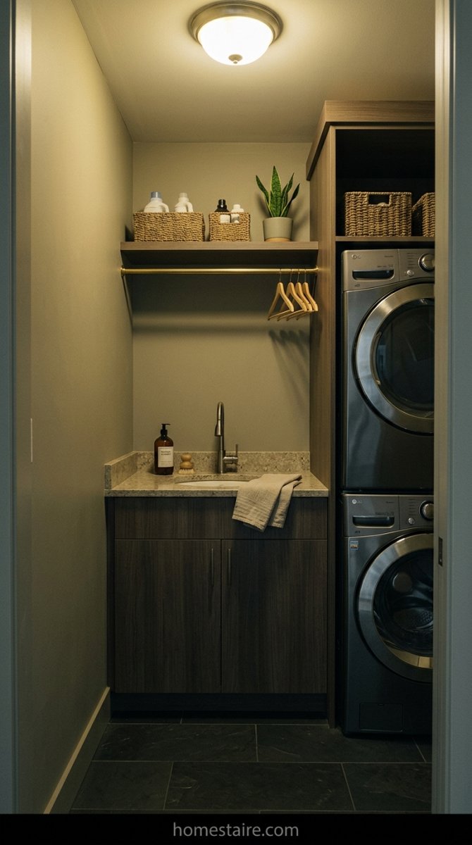
Greige is the “it” color for every living room on Pinterest, but it is a absolute trap for laundry closets. If you don’t have a big window, that expensive “perfect” greige is going to look like mud.
I tried a popular greige on my second attempt and I literally cried when it dried. It looked like I hadn’t cleaned my walls in fifteen years. In low light, those beige undertones turn into a flat, yellowish mess that just screams “sad basement.”
Save your money. Skip the greige.
This Soft Sage Green is My Secret for Killing the Gloomy Vibe
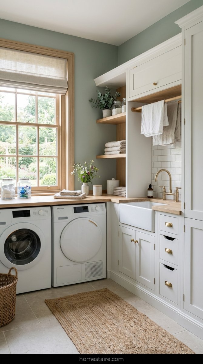
If you want a bit of color but you’re too scared to go full-on navy, get some sage. Not a bright, grassy green—that’s too much—but a dusty, muted sage.
It’s like bringing a plant into a room where real plants go to die. It felt fresh and weirdly calming. Even when my old, noisy dryer was rattling the floorboards and I had a mountain of crusty toddler socks to fold, the room didn’t feel heavy anymore.
It’s the only “light” color I’ve found that doesn’t turn gray the second you flip off the light switch.
Why You Must Check Your Light Bulbs Before Choosing a Paint Can
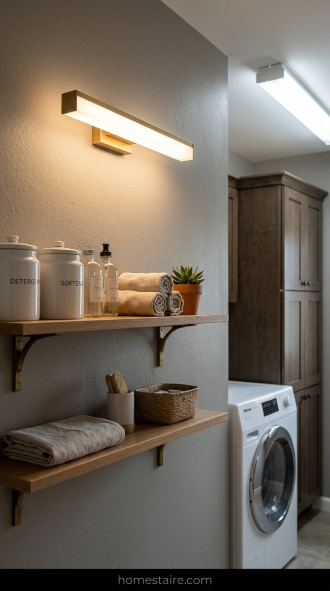
I spent fifty bucks on a “perfect gray” only to realize it looked like pea soup at night. My bulbs were the culprit. Most cheap LEDs cast this sickly orange or greenish glow that ruins everything.
Swap them for 3000K or 3500K “bright white” bulbs before you even touch a brush. Seriously. It’s the difference between a designer look and a gas station bathroom.
Don’t buy the “daylight” bulbs that look blue, either. Those make your laundry room feel like an operating room where socks go to die. Find a middle ground or your paint will never look like the swatch.
Charcoal Gray Works if You Stop Being Scared of Dark Walls
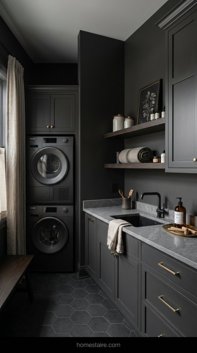
My mom told me I was nuts for painting a 5×5 closet charcoal. “It’ll feel like a coffin,” she said. She was wrong.
Dark colors like Iron Ore or Peppercorn actually make the corners disappear. When the walls are dark, your brain can’t tell where the room ends—it creates this weird depth. It hides the lint and the scuffs from the dryer too.
Total win.
Finding a Warm Cream That Doesn’t Turn Into a Sickly Yellow Glow

Creams are a nightmare. I once picked a shade that looked like a vanilla milkshake on the swatch but turned into “old teeth” once it dried.
The trick? You need a cream with a tiny bit of pink or gray in the base to keep it from going full banana. Look at Swiss Coffee—it’s the only one I trust now. It stays soft without looking like a smoker lived in there for twenty years.
If it looks too “buttery” in the store, put it back.
Why Glossy Finishes Are Way Better Than Flat Paint for Bouncing Light
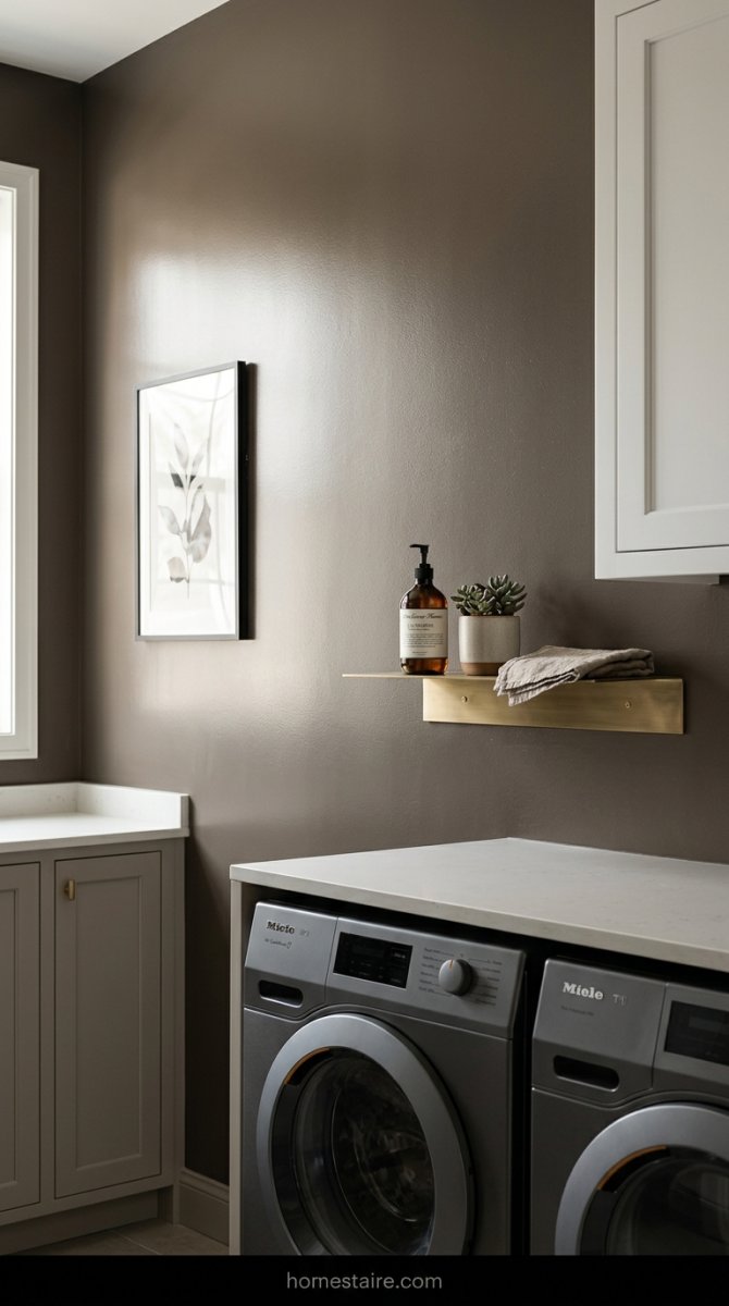
Flat paint in a laundry room is a massive mistake. I tried it once. Within a week, there were detergent drips and weird scuffs that wouldn’t wipe off.
Plus, it just soaks up the light and stays dead. Go for a semi-gloss or at least a satin finish. It acts like a giant mirror for whatever tiny light source you have. It makes the walls feel “wet” and alive instead of dusty and sad.
Scrubbable walls are a life-saver when a bottle of bleach leaks. Trust me.
The Dusty Rose I Used to Make Folding Clothes Suck a Little Less
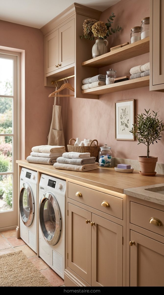
I know, pink sounds like a nursery choice. But a muted, dusty rose—think “clay” or “terracotta lite”—actually makes me want to stand in there.
It’s a warm hug of a color. It hides the blue-ish light from the dryer window and makes my skin look less like a zombie’s when I’m folding towels at midnight.
It’s the only color that made me stop resenting the chore. Well, almost.
The Weird Truth About How Dark Colors Hide Ugly Pipes and Plugs
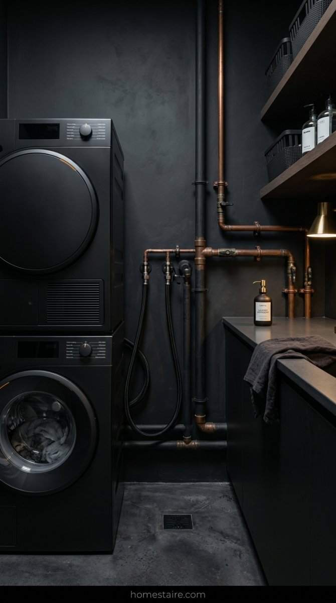
My laundry room has these gross black drain hoses and some crusty copper pipes sticking out right behind the washer. When the walls were bright white, those pipes screamed for attention—it looked like a basement scene from a horror movie. But once I slapped on a deep, moody shade? The shadows just swallowed all that visual junk.
It’s basically camouflage for your house.
The dark paint makes those utility lines just… disappear. You stop seeing the mess of gray cords and start seeing the actual vibe of the room. It’s a lazy person’s hack for a space that wasn’t built to be pretty, and honestly, it’s the only thing that worked for me.
Conclusion
I spent way too much money on sample cans before I finally got this right. My garage is basically a graveyard for “almost right” shades of blue and gray. But living in a room that doesn’t feel like a damp cave makes the endless piles of socks way easier to deal with. (My husband still thinks I’m insane for painting it four times, by the way.)
Pick a color that makes you feel good, even if it feels a little too bold when you first crack the lid.
Just stay away from that flat hospital white. You’ll thank me later.