
I spent three years staring at my kitchen and feeling… nothing. Well, that’s a lie. I felt annoyed. Every time I walked in to grab a snack, the vibe was just flat-out wrong. It wasn’t just that the cabinets were old; it was that they lacked any sort of soul.
I tried the whole “decorating with plants” thing to fix it. My pothos died within a month. Typical.
I finally realized that the problem wasn’t my lack of a green thumb—it was the colors. I needed a combination that didn’t feel like a depressing office park. I wanted something that felt like a hug every time I walked in to make toast.
Why the “All-White” trend made me feel like I was in a hospital
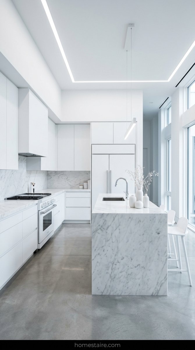
White kitchens are a trap. Seriously. I know they look great on Pinterest when they’re lit by ten professional softboxes, but in real life? It’s a lot. My sister went all-white in her remodel, and I swear I feel like I need a physical exam every time I visit her.
It’s just too sterile. There’s no place for your eyes to rest. Plus, if you drop a single crumb of toast, it looks like a crime scene.
I didn’t want to live in a surgery room. I wanted a space where I could actually spill a little coffee and not have a total breakdown because the “pristine” look was ruined.
Choosing a “Greige” that actually feels warm and lived-in
I bought about twelve different samples of gray paint. Most of them were terrible. They looked like wet sidewalk or a rainy Tuesday in a parking lot. No thanks.
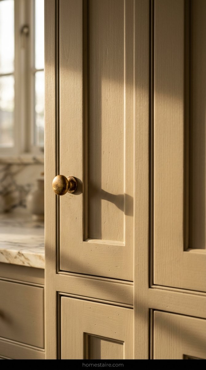
Then I found a “greige” that actually had some guts to it. It’s that perfect middle ground where it’s not quite tan but it definitely isn’t cold. It has these tiny hints of yellow and brown buried inside that only come out when the sun hits it.
It doesn’t scream “I’m gray!” like those modern farmhouse houses everyone is sick of. It just sits there and looks… cozy. Like an old sweater you can’t throw away.
My two-tone strategy for a kitchen cabinets color combination that pops
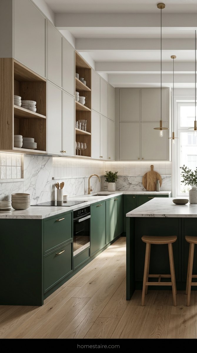
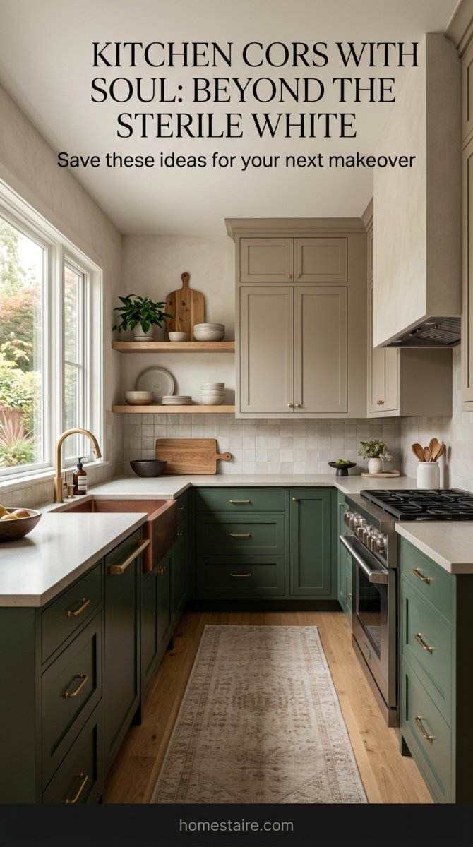
I decided to go dark on the bottom and light on the top. This was the best decision I ever made for my sanity. I used a deep, moody green—almost like a forest at night—for the base cabinets.
Why? Because I’m a mess. I have a dog that sheds and I’m clumsy with a vacuum. Darker lowers hide the scuffs and the hair.
For the uppers, I stayed with that warm greige I mentioned earlier. It keeps the room from feeling like a cave. If I had done that dark green everywhere, I probably would have felt like I was living in a hole. This way, the room feels grounded but still lets me breathe.
Why I added raw wood accents to stop the room from looking fake
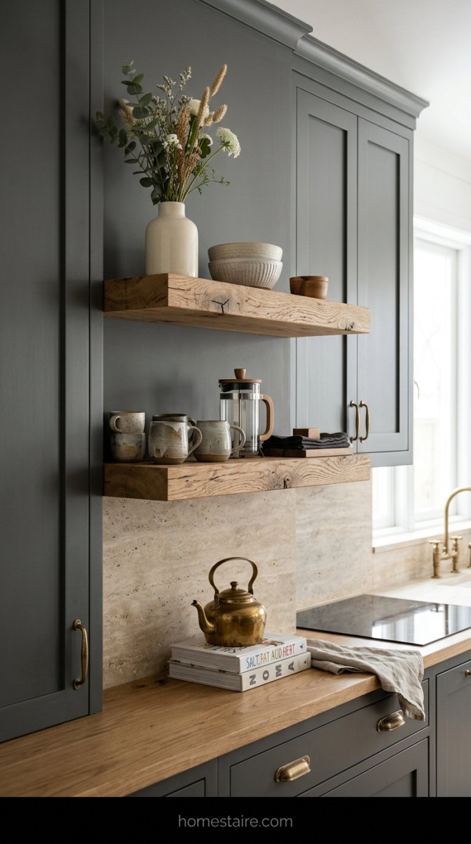
If you paint everything, your kitchen starts to look like it’s made of plastic. I’m not kidding. Too much paint makes a room feel like a dollhouse—and not in a cool way.
I ripped out two of my upper cabinets (I didn’t need that many coffee mugs anyway) and replaced them with thick, chunky raw oak shelves. I didn’t even stain them. I just used a clear sealer.
That little bit of wood grain changed the entire energy of the room. It makes the paint colors look more “real” and less like something I just slapped on to hide the wood. It’s the difference between a house that looks staged and a home that actually feels like someone lives there. It’s a game-changer.
Picking the right hardware so your cabinets don’t look cheap
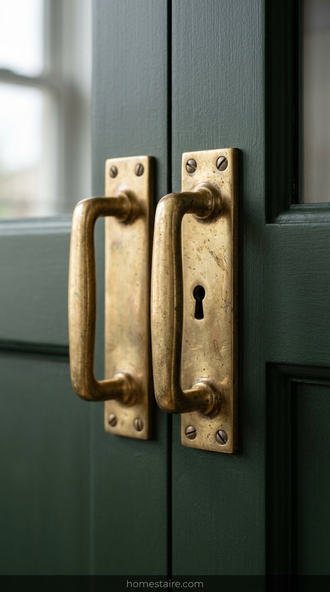
I learned this the hard way after spending a small fortune on custom doors. I tried to save money by buying those bulk packs of “gold” pulls from a big-box store—it was a total disaster. They felt light, like hollow plastic, and the color looked like a bad spray tan.
Cheap hardware has a way of screaming “I’m hiding something.”
If you want your kitchen to actually feel high-end, you need handles with some actual weight. I switched to unlacquered brass and suddenly the whole room felt expensive. It’s about the “clink” sound when your ring hits the handle. Weird? Maybe. But those tiny details are what keep your kitchen from looking like a kit from a warehouse.
The lighting test: How my paint changed from morning to night
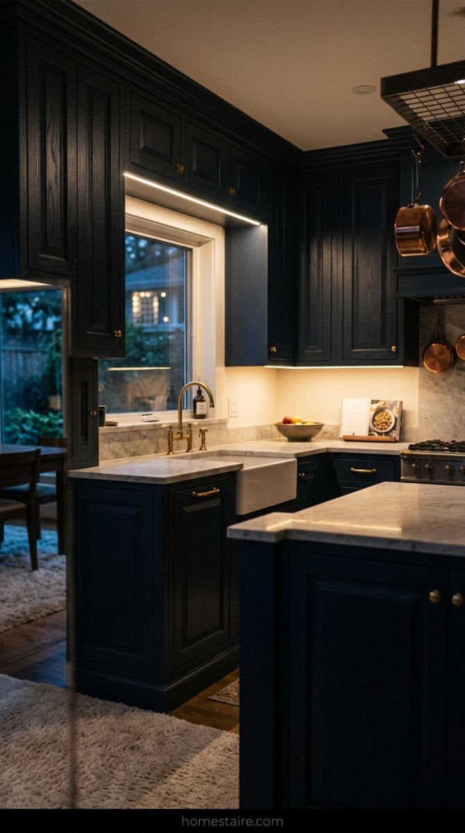
Paint is a shapeshifter and it will betray you. My perfect “warm greige” looked like a dream at 10 AM when the sun was hitting it. But once the sun went down and I turned on my overhead LEDs? It looked like the inside of a damp concrete basement.
I sat on my kitchen floor at 9 PM just staring at a cabinet door, feeling like I’d made a massive mistake.
Shadows love to hide in the corners of shaker panels. They turn light colors into muddy, grayish messes if you aren’t careful. You have to watch that paint for a full 24 hours. If it looks like a bruised banana under your evening lights, keep looking.
Coordinating with the floor so you don’t end up with a visual mess
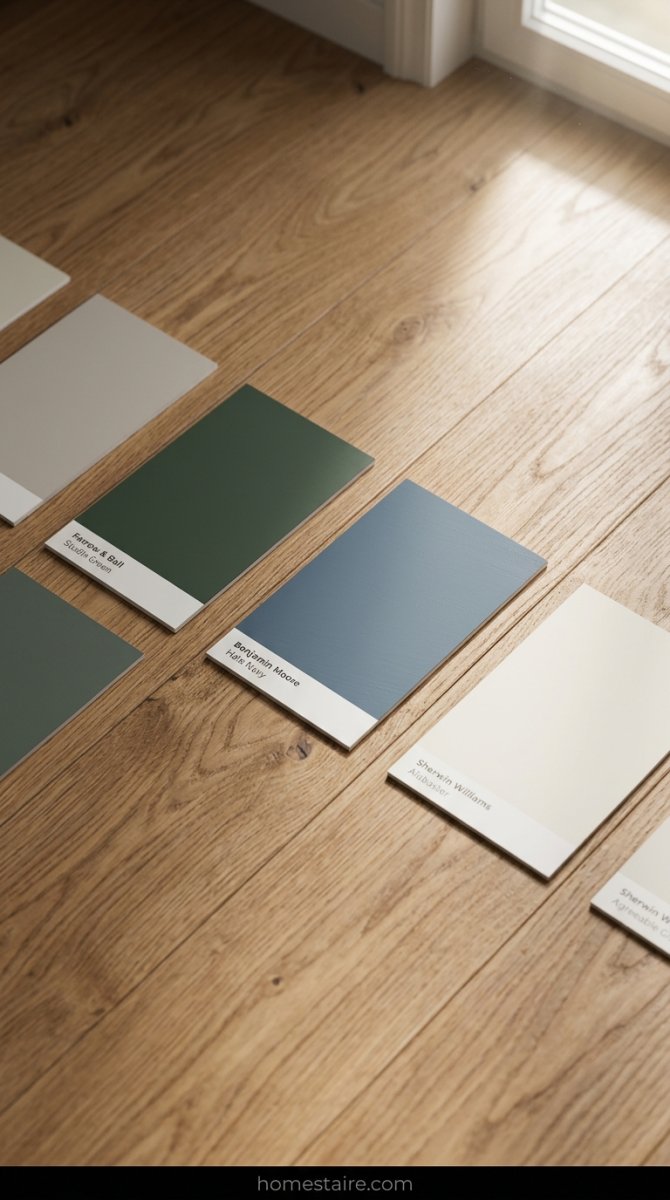
Your floors are the boss of the room. You can’t just ignore them and hope for the best. My neighbor painted her cabinets a cool, icy blue while having these orange-tinted oak floors—it looks like a circus in there. The colors are literally screaming at each other.
I spent hours holding my paint boards flat against the floorboards.
If your wood floors have a yellow or red undertone, you have to find a cabinet color that plays nice. I went with a shade that had a tiny bit of green in it to balance out the warmth of my wood. It’s a balancing act that most people skip because they’re too focused on the “perfect” Pinterest photo.
Why I ditched the “safe” colors for a dusty sage green
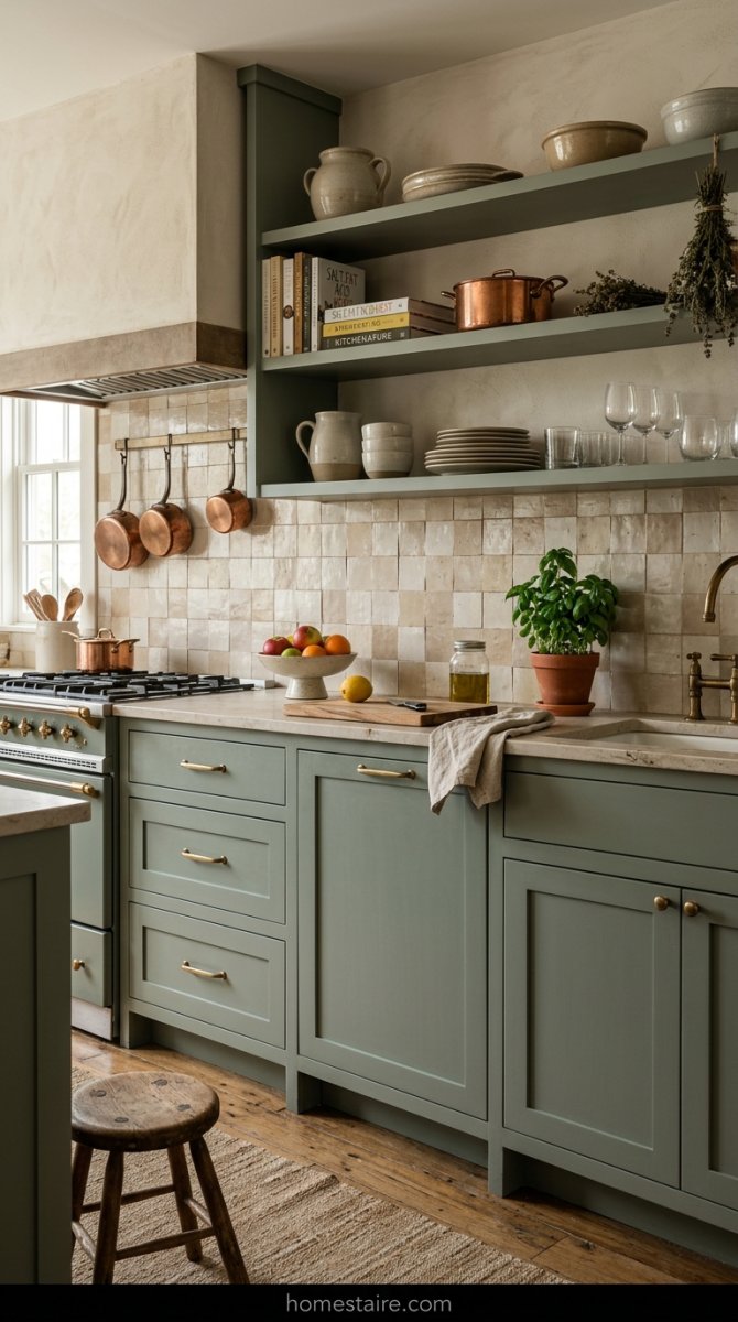
I spent three weeks looking at fifty shades of grey—and no, not the spicy kind, just the boring paint kind. I felt like a robot trying to pick the most “resale-friendly” color. Then I realized I don’t plan on moving for ten years, so why am I living in a colorless box?
Sage green is basically a neutral for people who have a soul.
It’s earthy, it’s quiet, and it doesn’t make me feel like I’m sitting in a doctor’s waiting room. Choosing a color with some actual pigment was the first time I felt excited about this renovation. It feels like a hug when I walk in to make coffee.
Testing samples on actual doors instead of just tiny paper strips
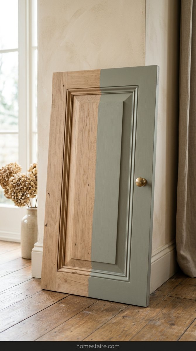
Those little 2×2 paper squares are liars. They are too small to show you how the light hits the bevels of a cabinet door. I went to a local scrap yard, grabbed an old door, and painted the whole thing.
My husband thought I was losing my mind, but it was the smartest thing I did.
You need to see the “flow” of the paint. How does it look in the recessed edges? Does it look patchy? Seeing it on a vertical surface at eye level is the only way to know if you’ll hate it in a week. Seriously—don’t trust the paper.
Choosing the right finish to avoid that weird, muddy look
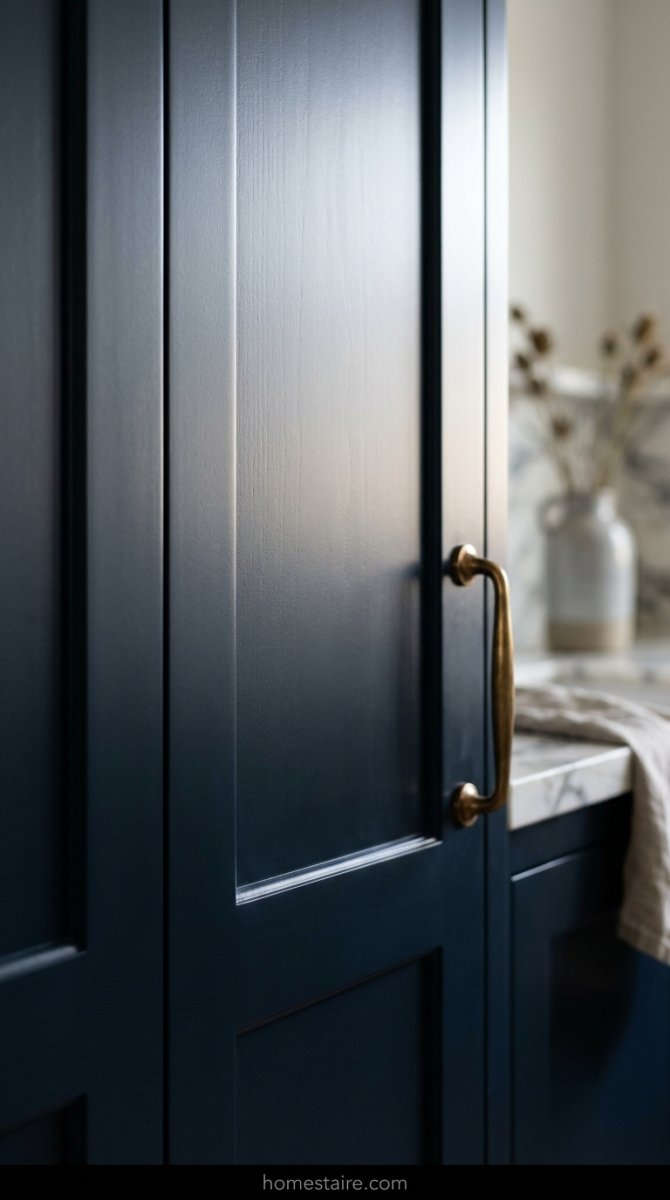
Don’t let the “matte finish” crowd trick you into buying paint that looks like dried mud the second a finger touches it. I learned this the hard way after painting my lower cabinets in a flat finish—it basically sucked the light out of the room and looked perpetually filthy. If you go too flat, your expensive “sage green” starts looking like a chalkboard in a basement.
I’m telling you right now: stick to a high-quality satin or a “cabinet-specific” semi-gloss.
The goal is a soft glow, not a mirror. You want just enough sheen to bounce a little light around without making your kitchen look like a cheap plastic dollhouse (and trust me, high-gloss is a total nightmare for showing every single bump or brush stroke in the wood).
Conclusion
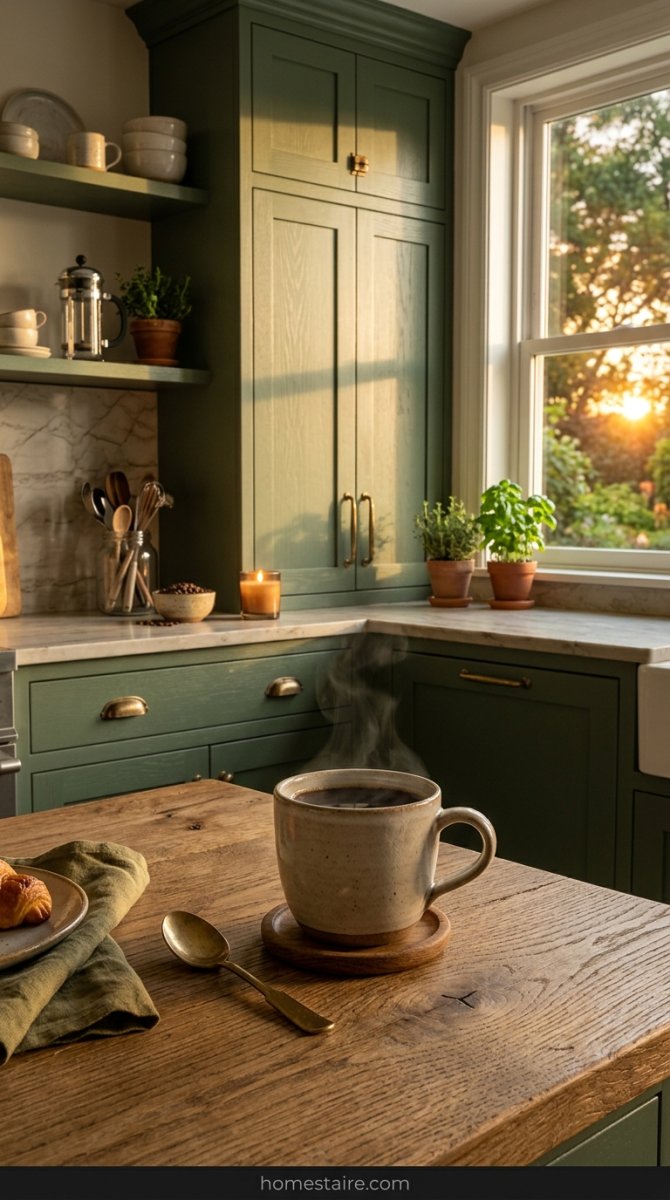
Stop playing it so safe. I spent three years staring at “rental white” because I was terrified of picking a color that would tank my home value—what a waste of time. My kitchen finally feels like a place where I actually want to drink my coffee instead of a sterile lab where I’m waiting for a doctor’s appointment.
Pick the color that stops the sadness. Seriously.
If you hate it in two years? It’s just paint. Grab a brush and do it again.