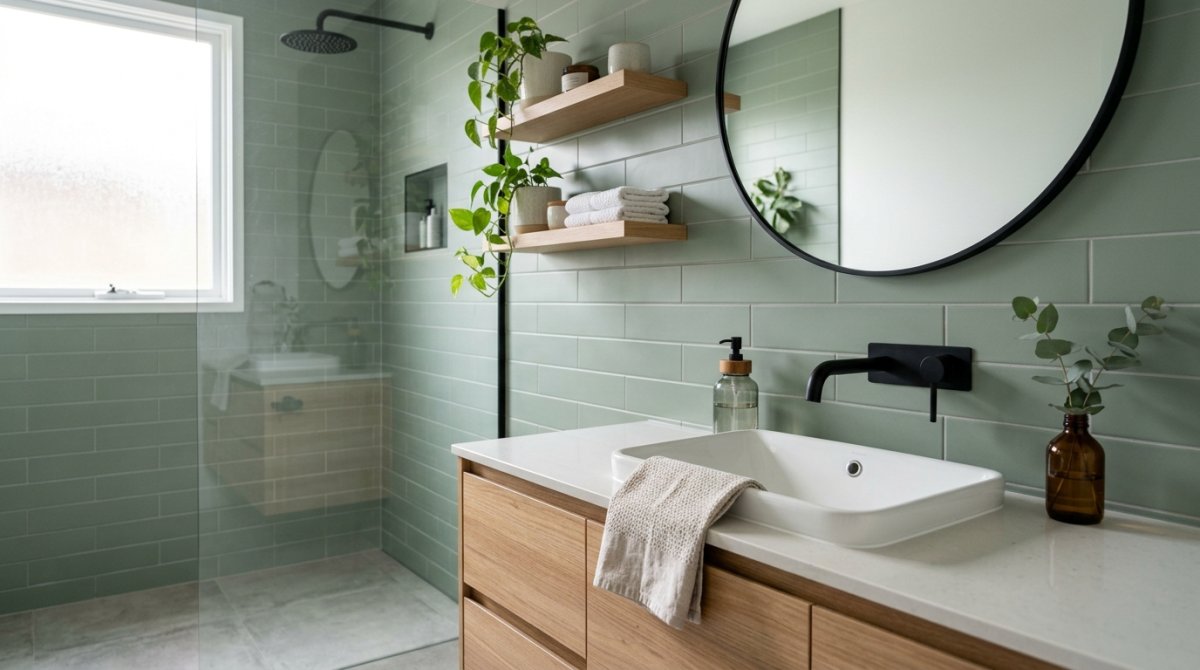
My Sterile White Bathroom Was Driving Me Crazy
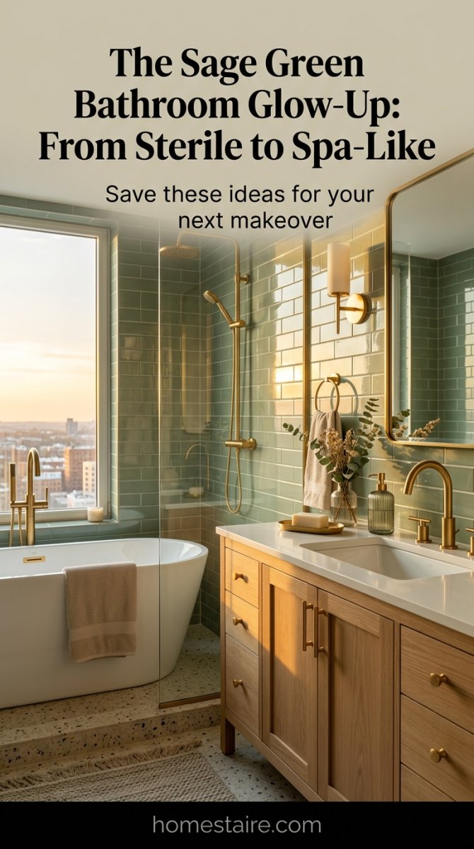
I woke up one Tuesday, looked at my shower, and genuinely wanted to cry. It was just so… white. Not a “clean, airy” white like you see on those Pinterest boards, but a cold, “I might be in a psych ward” white that made my skin look like a corpse in the morning light.
The builder-grade subway tiles were sucking the life out of me.
I needed color. Not “hospital blue” or “safe grey,” but something that felt like a forest floor after it rains—if that makes sense without sounding too hippie-dippy.
Finding ‘The One’: Why Most Sage Green Samples Looked Like Pea Soup
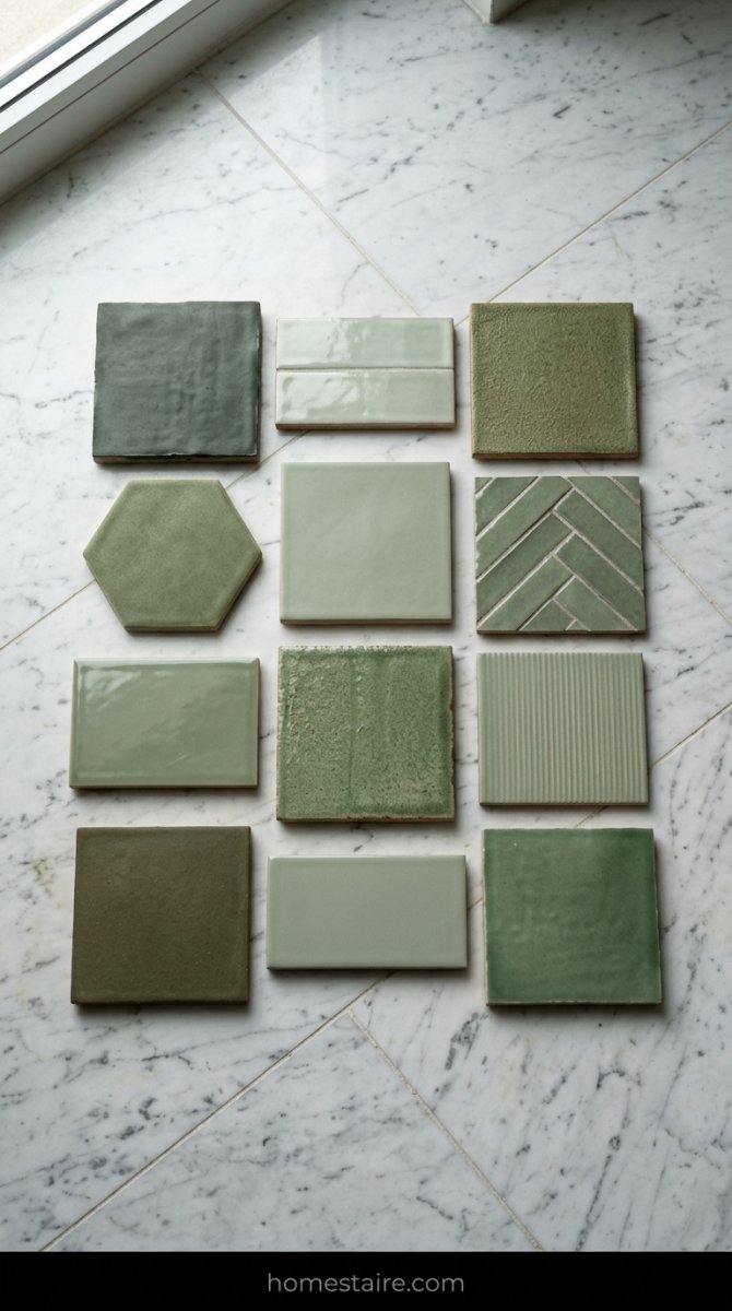
You wouldn’t believe how many shades of green actually look like curdled pea soup once you get them home. I brought back eleven samples from the tile shop—eleven!—and lined them up on the floor like some weird ceramic graveyard.
Under the shop’s fluorescent lights, they looked like “earthy sage,” but in my windowless bathroom, they turned into “overcooked broccoli” or “pantry mold.”
I finally found a tile that didn’t make me want to gag. It had these tiny flecks of brown and grey—real organic-looking stuff—that kept it from being too “neon” or too pukey.
The Matte vs. Glossy War and Why I Switched My Order Last Minute
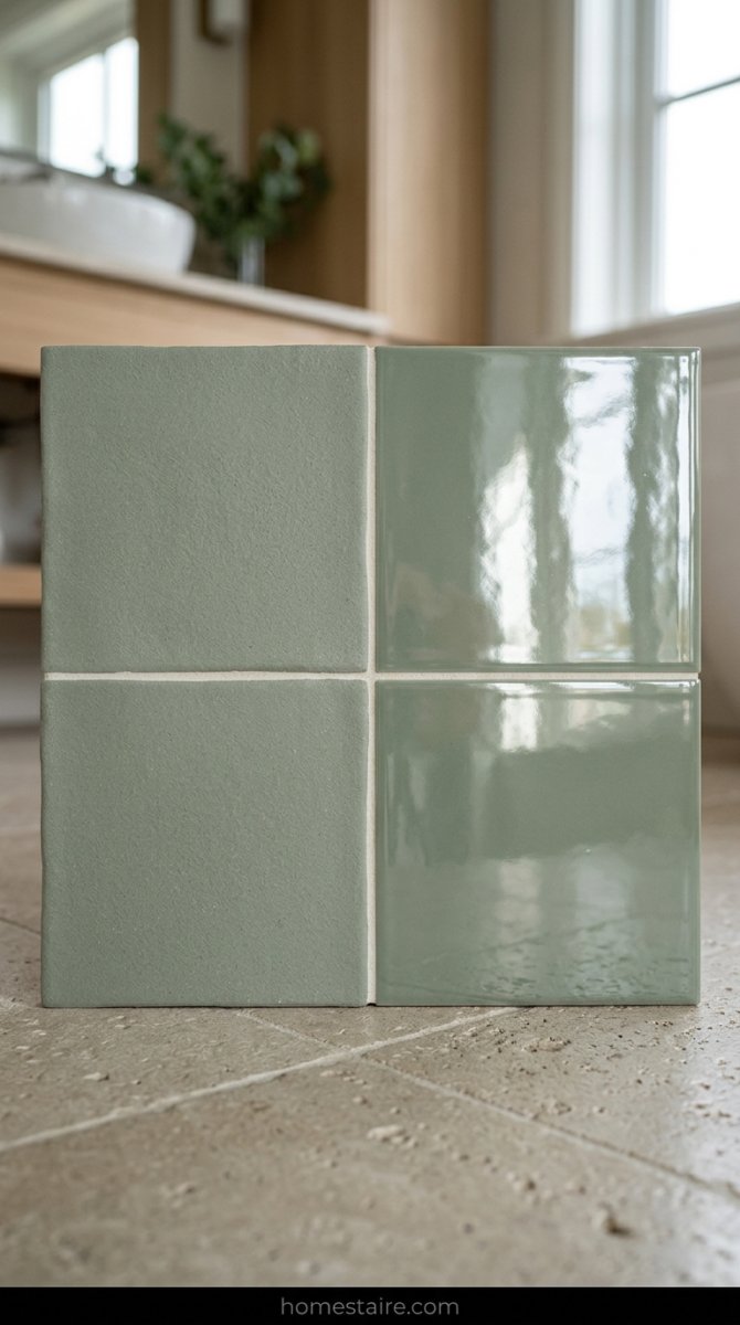
I almost bought the matte finish. I really did. My brain told me matte looks “expensive” and “chic” and all those other words people use to justify buying stuff that is a nightmare to clean.
Then I touched a sample with a slightly damp hand.
The smudge stayed there forever. (Imagine that, but with soap scum.)
I called the warehouse twenty minutes before they shipped my order and begged them to swap it for the high-gloss handmade stuff. It was the best panic-decision I’ve ever made. The way the light bounces off the shiny green surface makes the tiny room feel huge—like I’m showering inside a giant emerald.
Grout Colors Can Make or Break Your Aesthetic—I Learned This the Hard Way
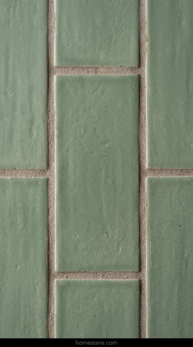
Don’t even think about using white grout with green tiles. Seriously. Just don’t. I spent a whole afternoon crying over a “Mushroom” grout sample versus a “Warm Grey” one, and my husband thought I’d finally snapped.
If you go too light, the green looks fake. If you go too dark, it looks like a dungeon.
I went with a “Warm Grey” that has just a hint of taupe. It makes the individual tiles pop without creating that harsh, grid-like look that makes your eyes hurt. It hides the grime, too, which is the real win here.
Pairing Green With Brass: A Marriage Made in Reno Heaven
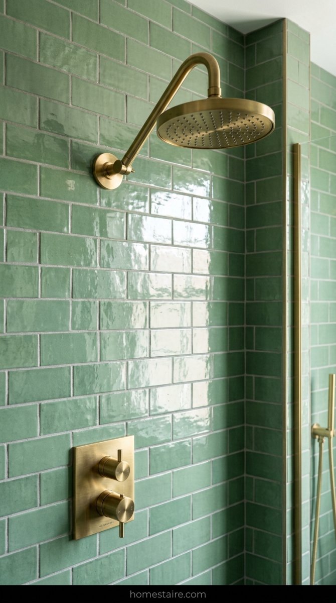
Forget chrome. Seriously, just throw your silver faucets in the trash if you’re going green. I tried a chrome handle against the sage and it looked like a 1990s dentist office—cold, sterile, and just plain wrong.
The second I held up a piece of brushed brass? Magic.
It’s like the green finally woke up. There’s something about the warmth of the gold-tones that makes the sage feel cozy instead of just “colored.” I spent way too much on an unlacquered brass shower head, and honestly, I’d do it again in a heartbeat. It’s the only thing in my house that makes me feel like a fancy hotel guest.
Why My 5000K LED Bulbs Made My New Tiles Look Like a Swamp
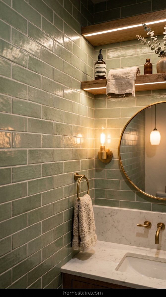
I flipped the switch and almost cried. My expensive sage tiles looked like a radioactive moss pit. Seriously. Those “Daylight” bulbs people rave about are a total trap if you’re using green. They suck the life out of the pigment and replace it with a weird, sickly blue cast.
I had to rip those 5000K LEDs out and swap them for 3000K Warm White before I could even stand to look at the wall. Warm light brings out the earthy, soft undertones—cool light just makes it look like a hospital basement from a horror movie. Lesson learned: never trust a bulb that claims to mimic the sun. It’s a lie.
Lighting changes everything.
Adding Raw Wood Accents to Keep the Vibe From Feeling Too Clinical
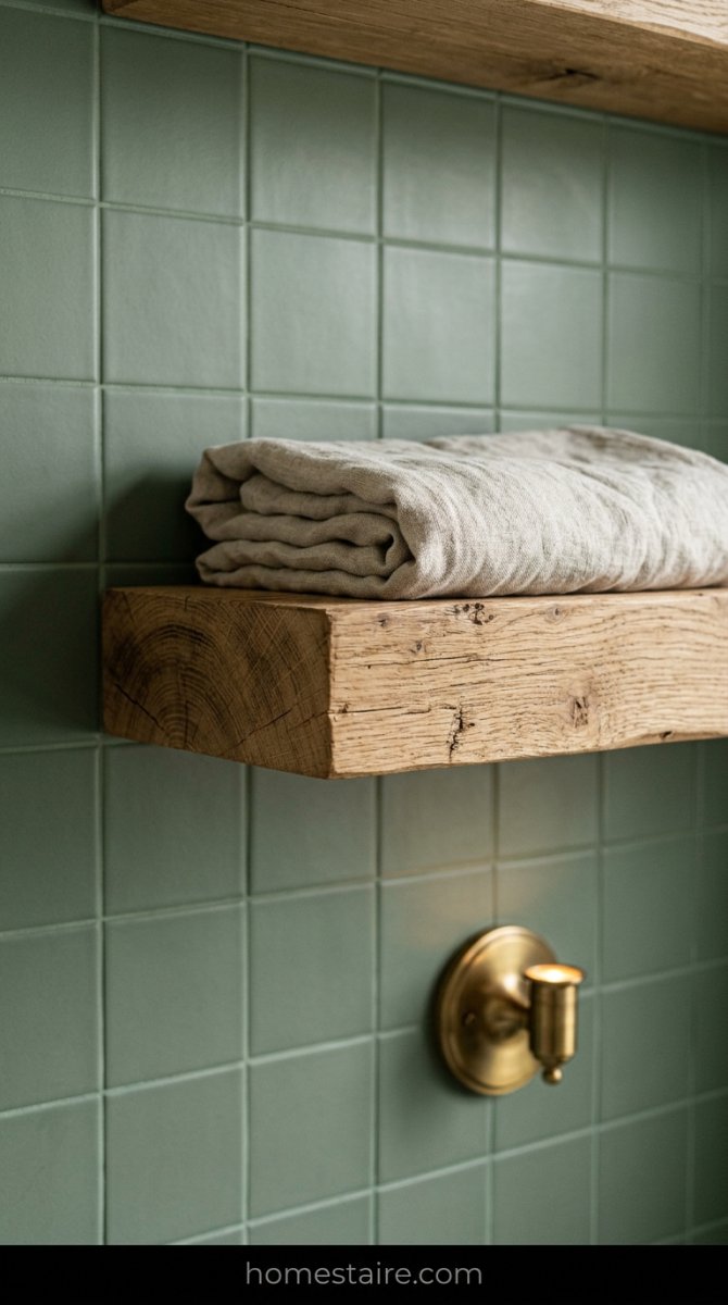
Total green overkill is a real thing. About halfway through the project, I realized my bathroom was starting to feel like a high-end dentist’s office. Not great. I grabbed a raw white oak floating shelf and some cedar soap dishes to break things up.
The wood acts like a visual reset button. It stops the green from being too “designed” and makes it feel lived-in and actually comfortable. Plus, the orange tones in the wood make the green pop in a way that white plastic never could. Keep it raw, though—stained wood makes it look like a 90s hunting lodge.
The Maintenance Reality: Does Green Show Toothpaste Spit?
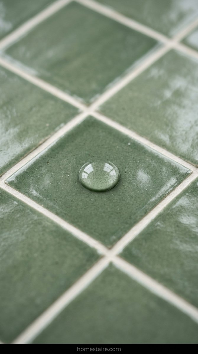
Here’s the gross truth you won’t see on Pinterest. My old white tiles hid nothing—every stray hair stood out like a sore thumb. Green is different. It’s a champ at hiding dust, but toothpaste? Oh boy.
If you’re a messy brusher (guilty), those white speckles show up like stars in the night sky. It’s annoying. But weirdly enough, water spots are basically invisible. I’ll take a few toothpaste dots over seeing every single hair on the floor any day of the week.
What I Actually Spent on This Mini-Renovation (It Wasn’t Cheap)

I told my partner this would cost $800. I lied. Between the shipping surcharges because the tiles were “heavy” (duh) and the fancy brass trim pieces that cost $40 a pop, I blew past $2,400 before I even bought the grout.
The tiles alone were $12 a square foot. Then there’s the “while I’m at it” tax—you know, when you realize your old faucet looks like literal trash next to new tile. My wallet took a beating. Don’t believe those DIY influencers who say you can redo a whole room for the price of a dinner out. They’re lying to you for clicks.
Dealing With the ‘Is This Too Trendy?’ Anxiety While Tiling
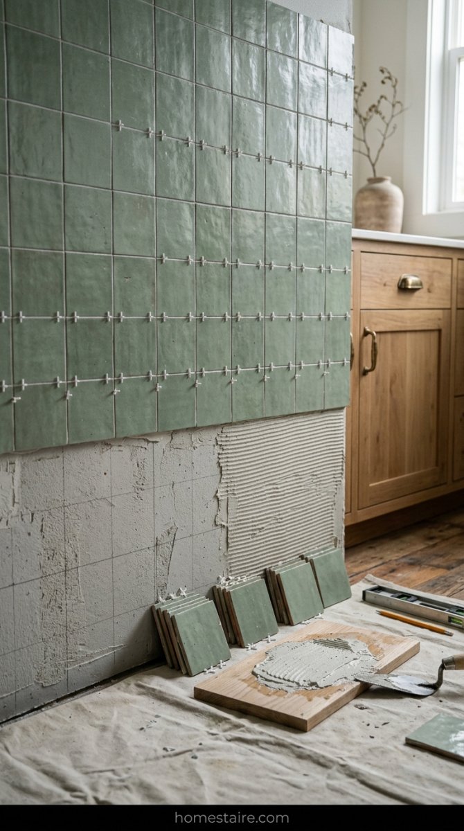
I had a full-blown panic attack three rows into the shower wall. Is sage green just the new “millennial pink” that everyone will mock in two years? Maybe. But then I looked at the white subway tile I just ripped out and realized I’d rather be trendy and happy than “timeless” and bored to tears.
Trends are just a way for people to feel bad about liking things. Screw it. If I hate it in five years, I’ll deal with it then. (Probably not, because tiling is a back-breaking nightmare, but you get my point).
It feels like me. That’s what matters.
The Weird Way This Color Actually Improved My Morning Mood
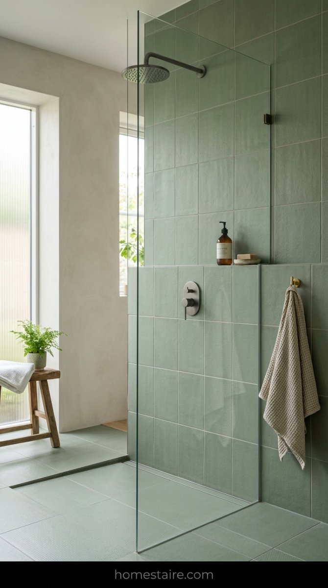
I used to stumble into my old bathroom and feel like I was being interrogated by a bright white lamp. It was harsh. Now, walking into this sage green setup at 6 AM feels like a slow, quiet exhale. I actually stopped dragging my feet during my morning routine—it’s weirdly meditative. Instead of rushing to leave a room that felt like a cold doctor’s office, I’m actually hanging out in there.
Seriously. I just stand there.
It’s the closest I’ll get to a spa day without paying $200 for a massage I don’t really want. If you’re a high-strung person who hates the sun, you need this color in your life. White is just way too loud for the morning.
Conclusion: Was the Mess and Money Worth the Result?

I spent way more than I planned—mostly thanks to a last-minute tile swap and some pricey brass taps—but I don’t regret it. Not even a little. The dust was a total nightmare (found grout on my cat’s tail twice), but the end result is a vibe that white tiles could never touch.
Total win.
Stop worrying about what the next owner might want or if green is “too trendy.” You’re the one brushing your teeth in there every night. If a specific shade of green makes you feel like a fancy person in a boutique hotel, just buy the tiles. The mess is temporary, but the “wow” factor when you walk in? That stays.