I used to think two-tone cabinets were just for people who couldn’t make up their minds. Then I saw my neighbor’s kitchen—a total wreck that looked like two different rooms got smashed together. Most people mess this up because they don’t get how colors actually talk to each other.
I’ve spent way too much time staring at swatches under crappy LED lights. You want that “magazine look” but usually end up with a “failed DIY experiment” vibe. It’s annoying.
Trust me—it’s not just about picking two colors you like. It’s about balance. If you do it wrong, your kitchen feels top-heavy or just plain weird.
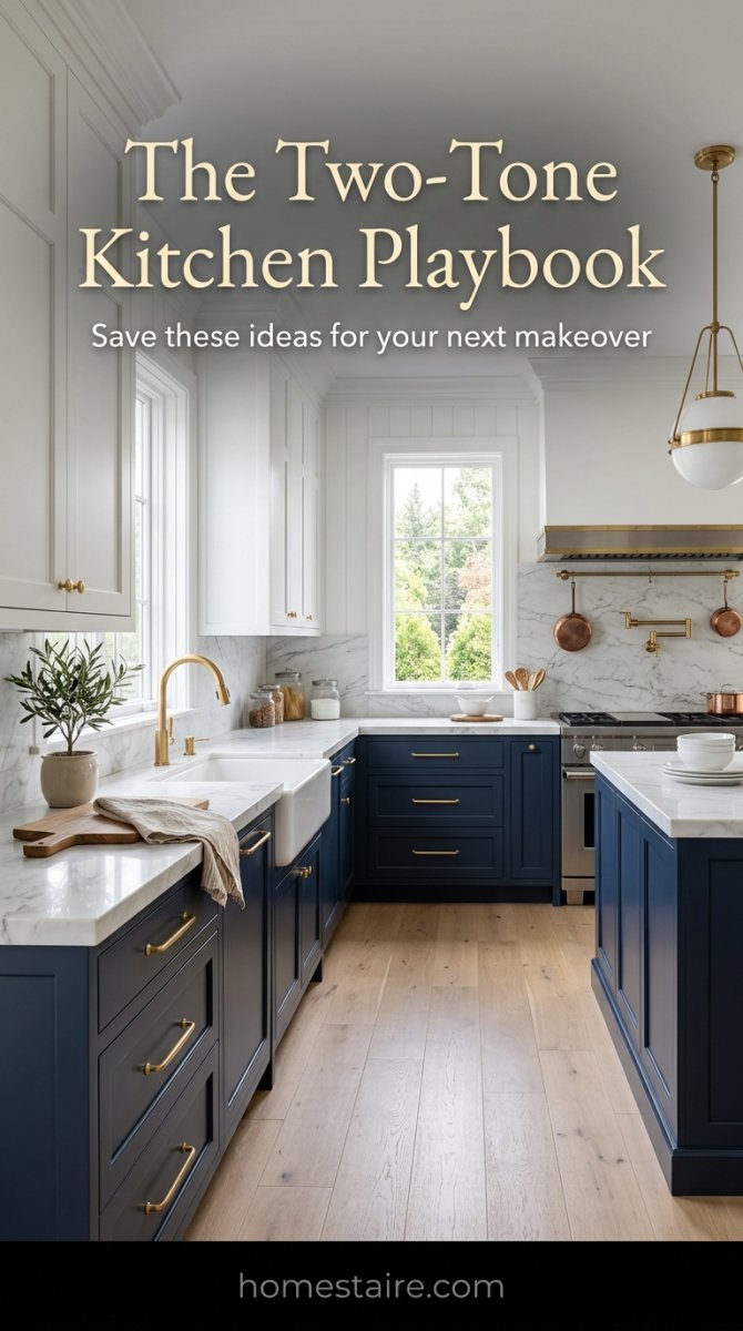
Navy and White: The Safe Bet That Actually Works
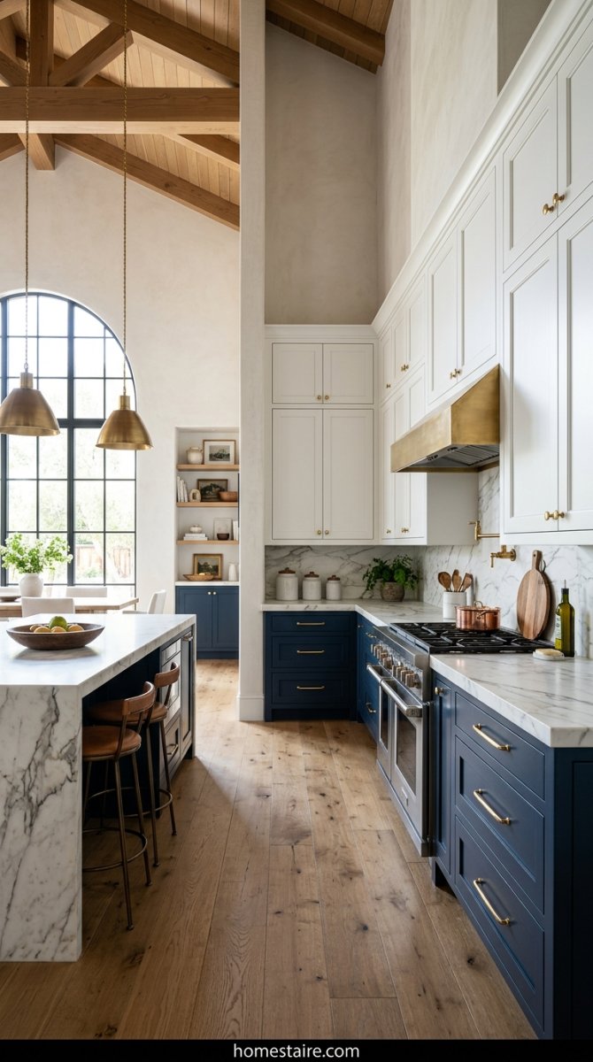
If you’re scared of color, just do this. It’s the “jeans and a white t-shirt” of kitchens. I always tell people to put the dark color on the bottom. Why? Because kids and dogs exist.
Navy hides the kick-marks from my toddler’s shoes way better than any white paint ever could. I once used a super dark indigo on a client’s lower cabinets and paired it with a bright, crisp white on top. The room felt ten feet taller instantly.
Seriously. It’s hard to screw this up.
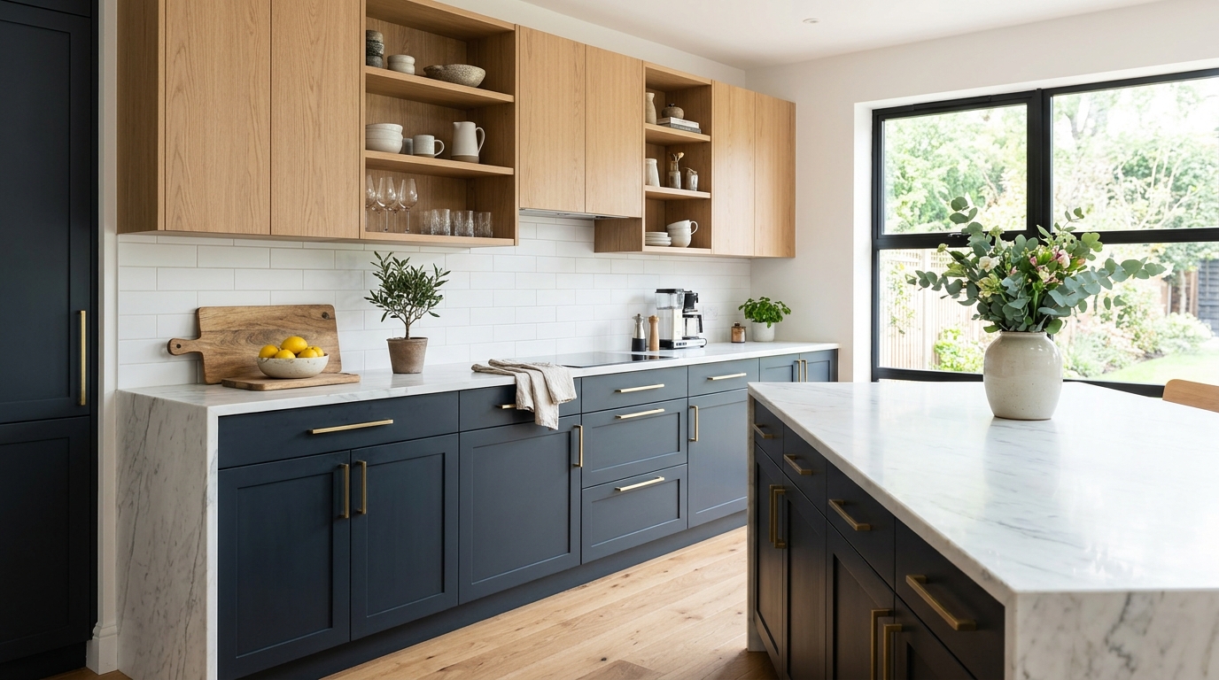
Natural Wood Islands with Black Perimeter Cabs

This one feels expensive. Like, “I own a vineyard” expensive. I saw a house last year with matte black wall cabinets and a thick, chunky oak island. (I actually hate high-gloss black—don’t do it, it shows every single fingerprint).
The wood softens the blow. Without that natural grain in the middle, a black kitchen can feel like a cave or a dark office.
I’ve noticed that people who go this route usually regret it if they pick a wood that’s too orange. Stick to something sandy or muted. It keeps things grounded.
Dark Green Lowers and Creamy White Tops
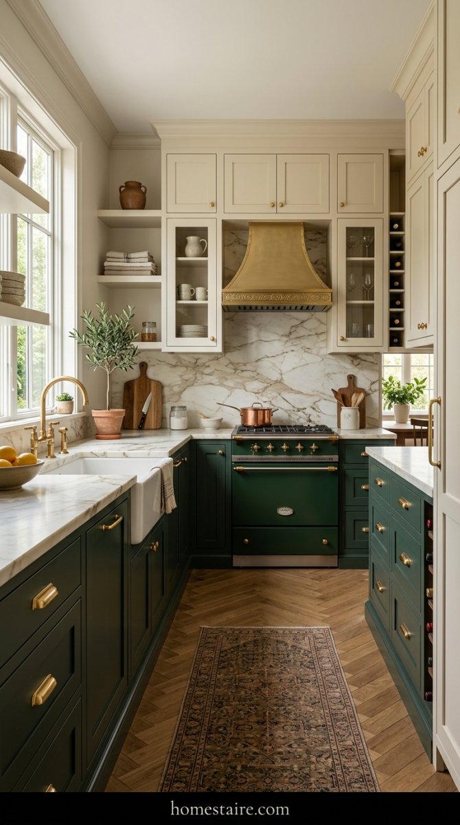
Green is having a massive moment right now. But don’t go for a neon green or something that looks like a lime. Think “old library” or “mossy rock.”
I paired a deep forest green with a warm cream (not a sterile white) on a flip house three years ago and it sold in two days. People went nuts for it. It feels cozy but looks high-end.
Dark green hides grease better than you’d think. Plus, it makes gold hardware look like a million bucks.
Charcoal Grey Mixed with Light Ash Wood

This is for the “less is more” crowd. It’s moody but somehow stays bright. If you use a light ash or white oak, it keeps the charcoal from looking like a basement.
I’ve noticed that if the grey has too much blue in it, the whole thing looks like a cheap dentist’s office. Stick to a true, smoky charcoal.
It’s a vibe. Very Scandi, very clean, and totally hides the fact that you haven’t dusted the baseboards in a month.
The Sharp Tuxedo: Classic Black and White
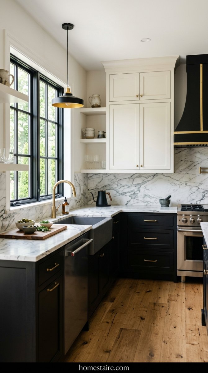
I once walked into a house where the owner used high-gloss black on every single cabinet. It looked like a 1980s bowling alley—not the vibe we want. If you’re going for the tuxedo look, keep the black on the bottom and make it matte. Like, deeply, void-of-all-light matte.
White uppers are the only thing that keeps a black kitchen from feeling like a literal dungeon.
I’ve found that using a slightly “off” white—something with a tiny bit of cream—prevents the space from feeling like a sterile doctor’s office. It’s a crisp look that never goes out of style. Just don’t forget to wipe the flour off those black doors when you’re baking. It shows everything.
Sage Green and Soft Maple for a Chill Vibe
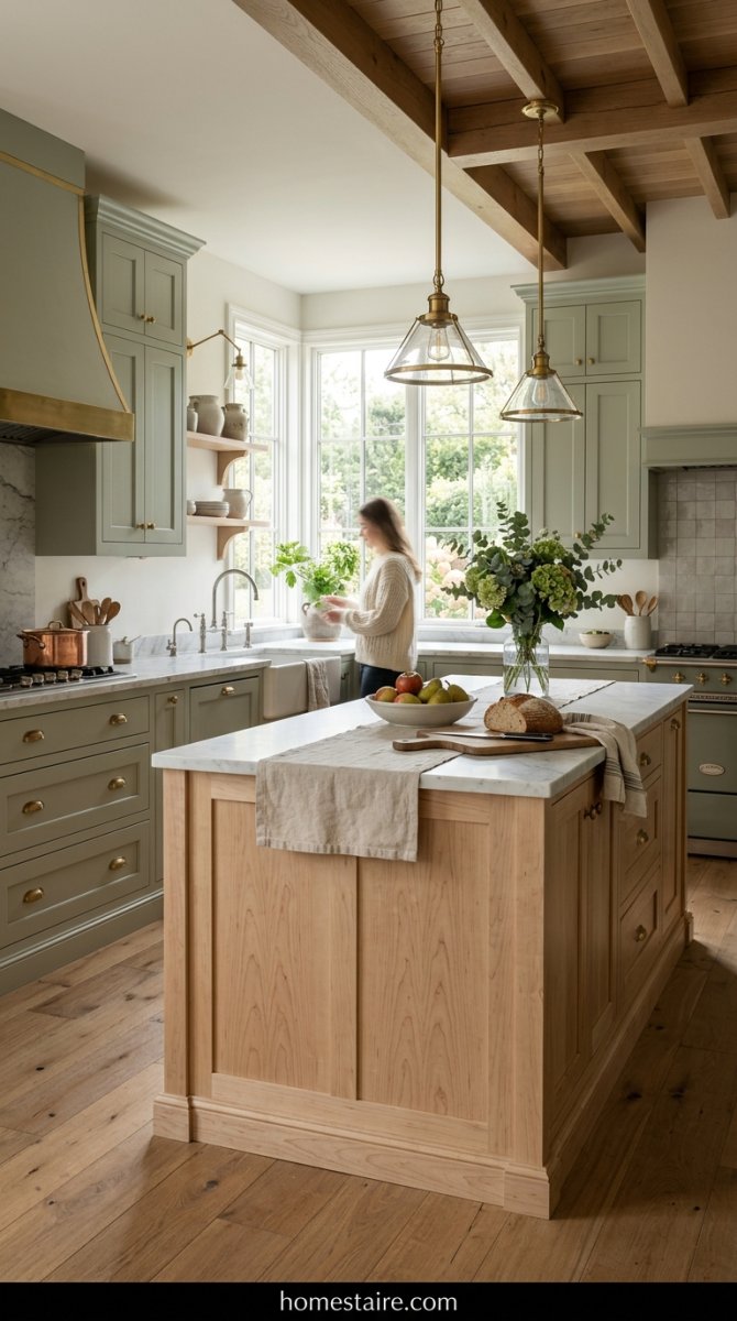
If you’re someone who gets stressed out just looking at a sink full of dishes, this is your combo. It’s basically a literal Xanax for your kitchen. I put this in a tiny cottage last summer and the transformation was wild.
The maple wood adds a hit of warmth that stops the green from feeling too “hospital hallway.”
Just make sure your maple isn’t too yellow. If the wood looks like a basketball court, you’ve gone too far. Aim for that pale, raw wood look—it makes the sage look expensive instead of just “crafty.”
Dusty Blue with Marble Stone Hits
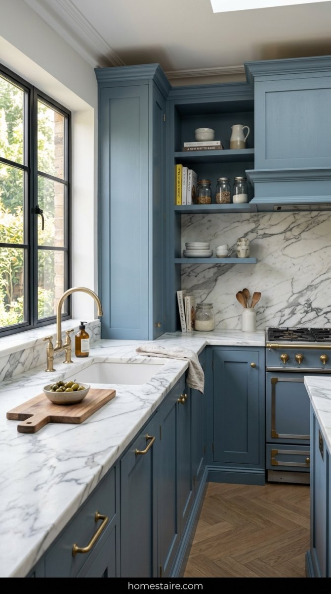
Blue is a total trap. I’ve seen people pick a blue that looks great on a tiny swatch but ends up looking like a giant nursery room once it’s on twenty cabinets. You have to go grayer than you think.
The secret sauce here? Marble. Or at least something that looks like it.
The grey veins in a stone countertop act as a bridge between the blue lowers and the white uppers. Without that stone, the two colors just sit there staring at each other like awkward strangers at a party. It’s the “glue” that makes the whole room actually make sense.
Warm Greige and Walnut for a Rich Look

Greige usually makes me want to scream into a pillow because it’s so boring, but walnut changes the game. It’s the “old money” look of kitchen design. When you pair a muddy, warm grey with the dark grain of walnut, it looks like you spent $100k on a remodel even if you didn’t.
I like to use the walnut for the island and keep the perimeter cabinets greige.
It feels grounded. Serious. Like you probably own a collection of expensive leather-bound books or something. Just watch out for “cool” greys here—they’ll clash with the wood and make the whole room look muddy and sad.
Earthy Terracotta Paired with Bone White
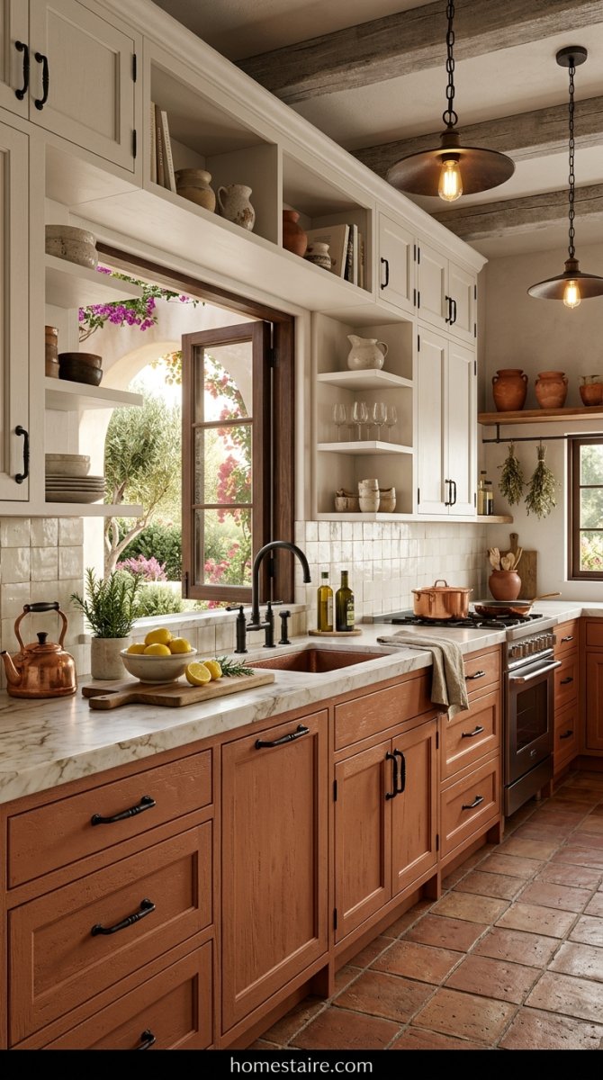
Most people are terrified of orange-adjacent colors in a kitchen. I get it. But terracotta isn’t “70s shag carpet” orange. It’s more like a baked clay pot in a sun-drenched garden.
Pairing this with a “bone” white—stay away from anything blue-toned—makes the kitchen feel like a vacation home in Mexico.
Seriously. It’s bold, but it works if you keep the hardware simple. I’d go with raw brass or even black iron handles to keep it feeling earthy and not like a fast-food joint. It’s a risky move that pays off if you have the guts to actually do it.
Pale Mint and Espresso Wood Tones

Mint belongs in a mojito, right? That’s what I thought until I saw a kitchen that paired this “dentist office” green with a wood so dark it was basically black. The espresso wood anchors the whole room—it stops the mint from looking like a baby’s nursery.
It’s a vibe.
I once saw a DIYer try this with a cheap pine stain instead of a true espresso. Big mistake. The yellow in the pine fought with the green and made the whole kitchen look like a bowl of bad split pea soup. Stick to those deep, chocolatey wood tones or don’t bother.
Midnight Plum and Gold Accents for Real Drama
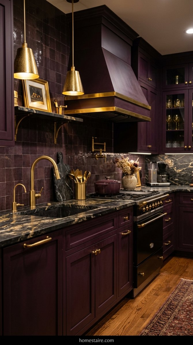
Don’t freak out on me. Midnight plum is a mood, and it’s a heavy one. In most lights, it just looks like a rich, velvety black—until the sun hits it. Then? Boom. You get this royal purple glow that makes your kitchen look way more expensive than it actually is.
My sister-in-law thought I was losing my mind when I suggested this for her remodel.
Then she saw the gold handles against the dark paint. It’s pure magic. But a word of warning: if you go with silver or chrome here, the whole thing ends up looking like a cheap goth basement from 2004. Keep the hardware warm.
Why your split line might look like a mess
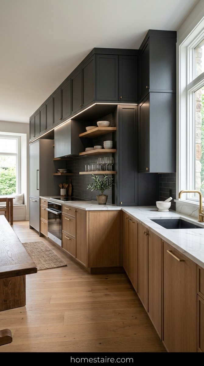
I’ve seen some absolute train wrecks where people try to switch colors mid-wall. Just stop. If you don’t have a natural break—like a corner or a change in cabinet height—it usually looks like you just ran out of paint halfway through the job.
It’s awkward.
Keep the “split” simple. Do the island one color and the perimeter another. Or, do the lowers dark and the uppers light. Trying to get fancy with vertical splits on a flat wall is a one-way ticket to Regret Town—population: you.
My weird rule for hardware on two-tone sets
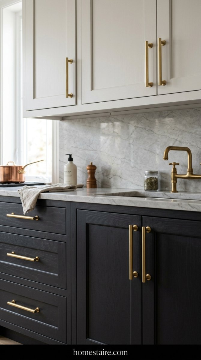
Here’s my hill to die on: use the exact same hardware everywhere. Some designers will tell you to match the knobs to the specific cabinet color—I think that’s total nonsense. It makes the kitchen look like two different rooms that were glued together by accident.
Pick one metal. Stick to it.
(Unless you’re some kind of design prodigy, but for us regular folks, consistency is king). If you have navy lowers and white uppers, brass looks killer on both. Mixing metals on top of mixing cabinet colors is just too much noise for your eyeballs to handle.
How to keep a small kitchen from feeling cramped
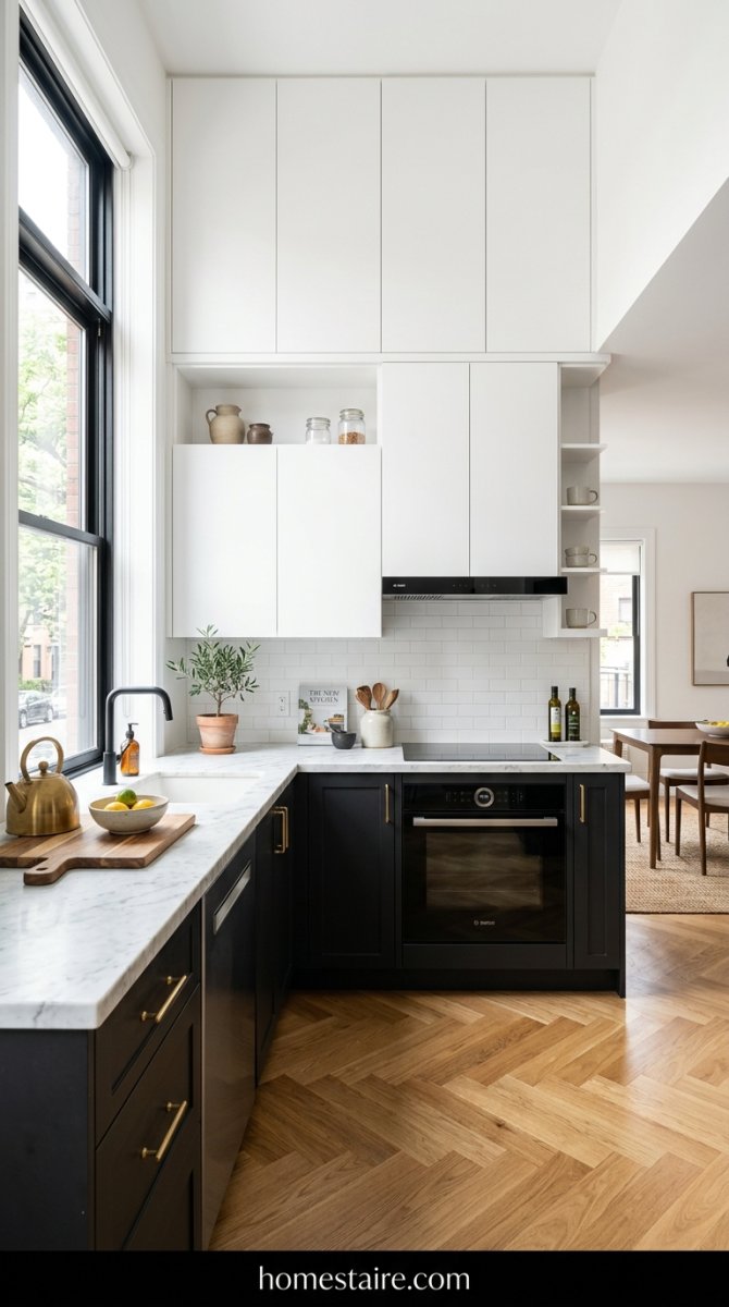
Gravity is a thing. Keep the heavy, dark colors on the bottom cabinets. If you put black or dark grey uppers in a tiny galley kitchen, you’re going to feel like the walls are closing in on you while you’re just trying to make some toast.
No thanks.
I always tell people to go with white or a very pale cream on the top. It tricks your brain into thinking the ceiling is a foot higher than it actually is. I did this in my first apartment—a tiny shoebox with zero windows—and it was the only thing that kept me from feeling like I was living in a literal cave.
The paint sheen secret that hides sticky fingerprints

Everyone tells you to go for semi-gloss because it wipes down easy. They’re right—mostly. But semi-gloss shows every single brush stroke and every tiny dent in the wood. It’s too shiny. If you want that high-end look without the glare of a thousand suns, you need a high-quality Satin. It’s the sweet spot.
Matte is a trap.
I once did my lower cabinets in a flat charcoal finish because I saw it in a magazine. Big mistake. My toddler touched one door after eating a grilled cheese and that grease mark stayed there until I eventually sanded the whole thing down. Now I only use Satin or “Eggshell” (if the brand is fancy enough). It hides the peanut butter smudges but doesn’t look like a cheap plastic toy.
Conclusion

Look, your kitchen doesn’t have to be a perfect Pinterest replica on day one. Just pick two colors that don’t make your eyes hurt and commit to the bit. If it looks slightly off? You can always swap the hardware or change a lightbulb. That’s the beauty of it—nothing is permanent. Now go buy some samples and stop overthinking your life choices. Seriously. Just start painting.