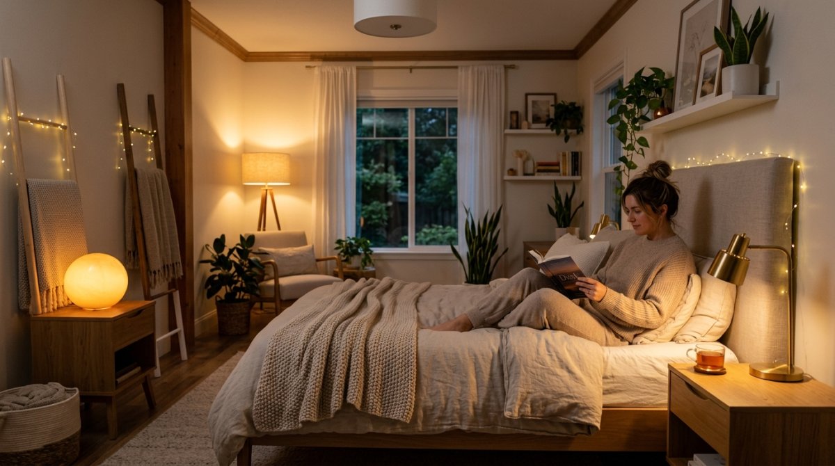

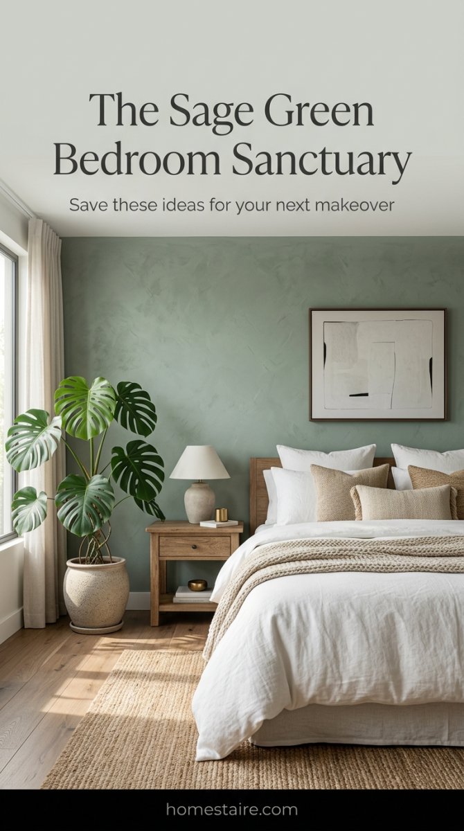
My bedroom used to look like a sterile doctor’s waiting room. White walls, white sheets, total snooze fest. I woke up one Tuesday, looked at my boring walls, and decided I needed a change before I lost my mind.
I honestly thought I was a “white walls forever” person. I was wrong.
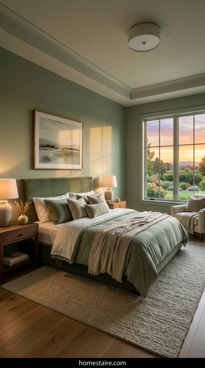
Now? My room feels like a quiet forest. It’s the kind of space that actually makes me want to put my phone away and just… exist. I didn’t think paint and some new sheets could fix my mood, but here we are.
Why I dumped my boring white walls for sage green
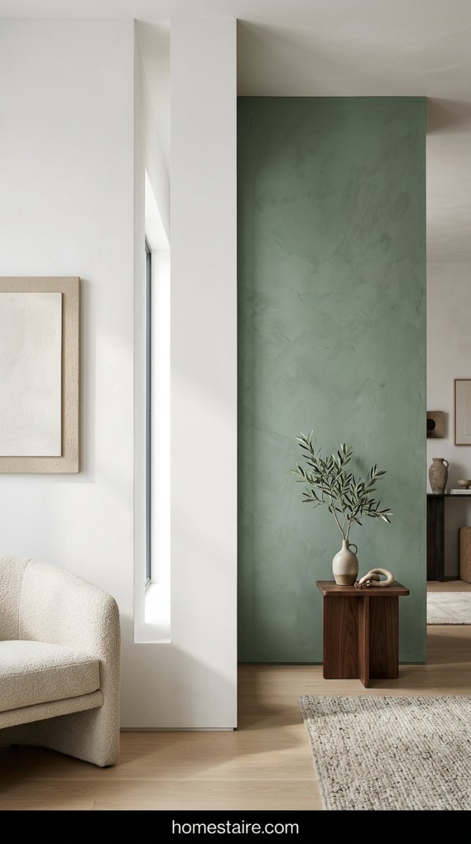
White paint is a total scam. Everyone says it makes a space feel “bright,” but for me, it just felt cold and unfinished. I was tired of seeing every tiny scuff mark and cat hair highlighted by the “airy” lighting.
I wanted my room to feel like a cave. A cozy, earthy cave where I could actually sleep past 7 AM.
Sage green has this weird way of feeling like a neutral but actually having a personality. It’s like a hug for your brain. The second I rolled that first bit of green over the white, I felt my heart rate go down. Seriously.
Finding that one specific paint shade that doesn’t look like pea soup
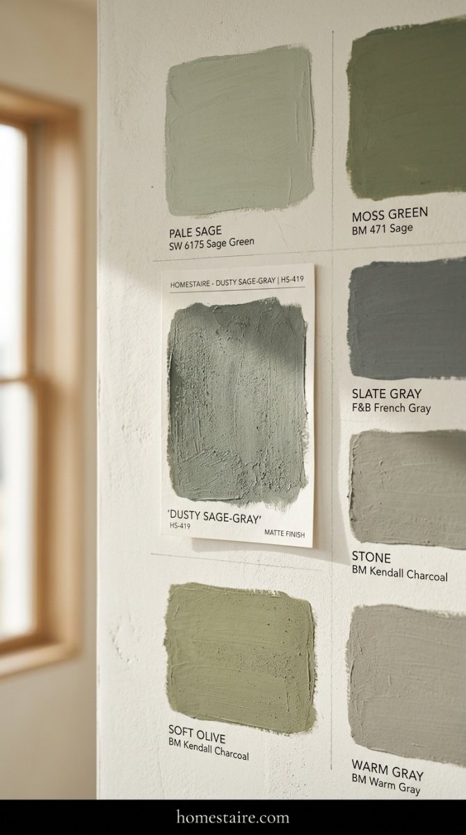
I bought six different samples. Six! I felt like a crazy person painting little squares all over my wall, watching them change as the sun moved. One of them looked like straight-up pea soup from a can once the afternoon light hit it. It was gross.
Another one looked almost neon. Not the vibe.
I finally found the winner—a dusty, gray-leaning sage that doesn’t scream “I LOVE VEGETABLES.” If you’re doing this, look for the shades that look almost gray on the paper swatch. They always turn more green once they’re on all four walls. Don’t skip the sample step or you’ll regret it.
I spent way too much money on linen bedding—and I don’t regret it
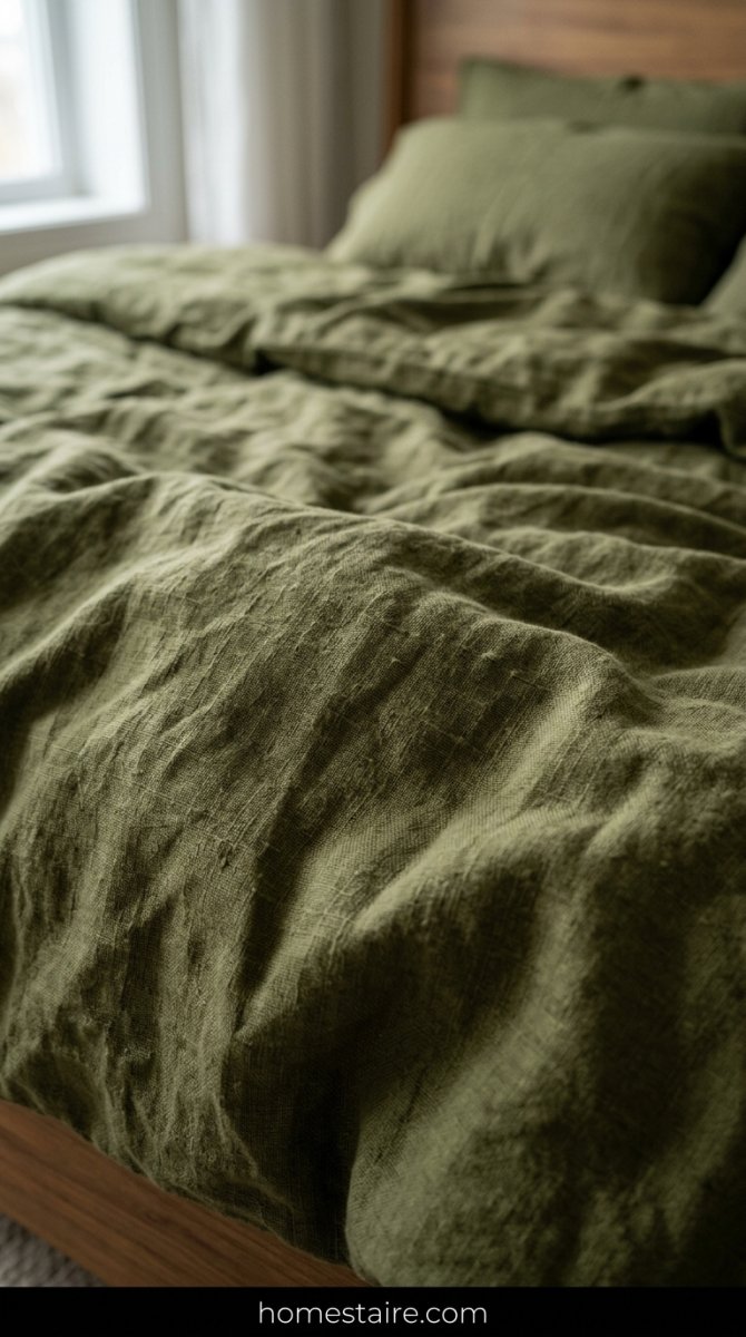
My credit card actually groaned when I clicked “buy” on those olive linen sheets. I’m talking three figures for something I literally just drool on every night. It felt reckless at the time.
But man, the texture? It’s everything.
Linen has that messy, “I just woke up like this” look that regular cotton just can’t pull off. It’s slightly scratchy at first—don’t freak out—it gets softer every time you wash it. Plus, it breathes. No more waking up in a sweat because my polyester blankets decided to trap all my body heat.
Mixing different greens so the room doesn’t look like a flat box
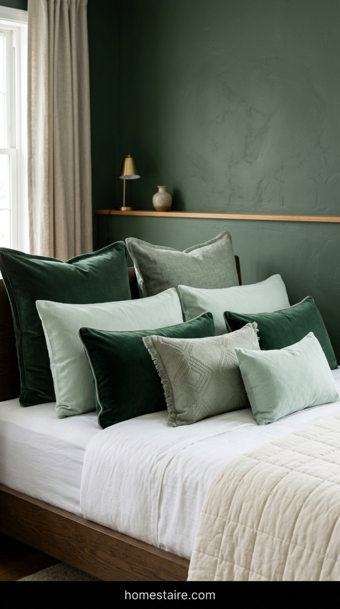
Here is the thing: if you match your walls to your pillows to your rug exactly, your room will look like a green screen. It looks flat and cheap. I made that mistake at first and it felt like living inside a tennis ball.
I fixed it by mixing in some deep forest green velvet pillows and a light minty throw blanket.
It adds depth. You want layers, not a uniform. Think about a forest—trees aren’t all one color, right? They’ve got shadows and highlights. Get weird with the shades and it’ll actually look professional.
The wood furniture trick that keeps things from looking too “modern farmhouse”
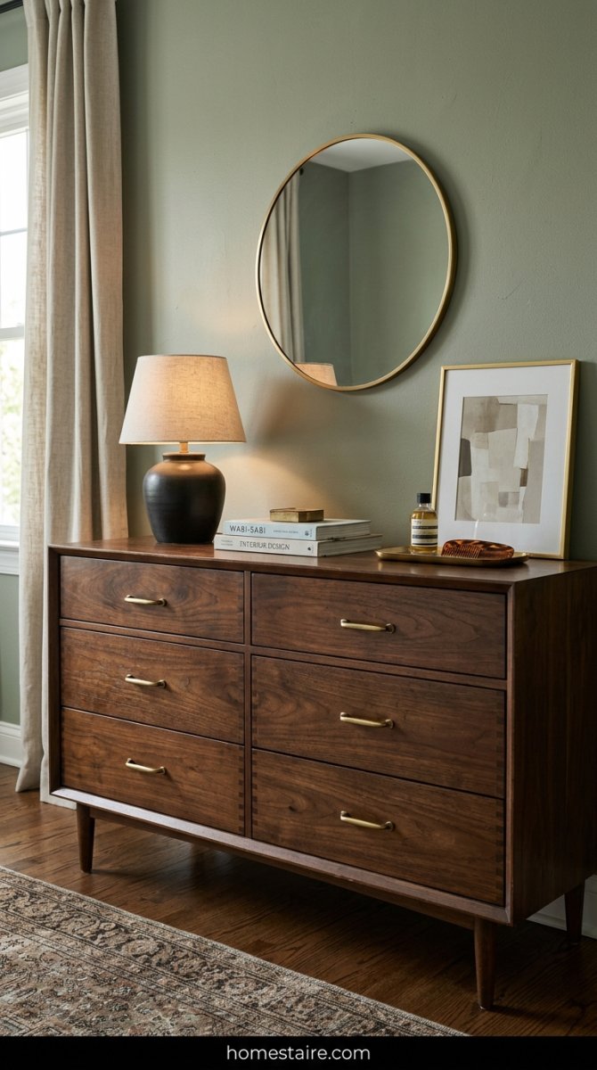
I almost fell for it. I almost bought that white-washed, distressed oak dresser everyone on Pinterest seems to own. Glad I didn’t. If you go too light with the wood, sage green starts to feel a bit too much like a suburban craft store—and nobody wants to sleep in a Hobby Lobby.
Dark wood is the secret sauce here. I snagged a vintage walnut chest from a thrift shop that was half-covered in old coffee rings. After a quick polish, it looked incredible against the sage. The deep, chocolatey brown grounds the green. It makes the room feel like an old library instead of a “live-laugh-love” shrine.
Don’t match your woods perfectly. That’s a rookie move. I have a medium-toned nightstand and a darker bed frame, and that messiness is what makes it feel real.
Lighting matters more than you think when you’re dealing with muted tones
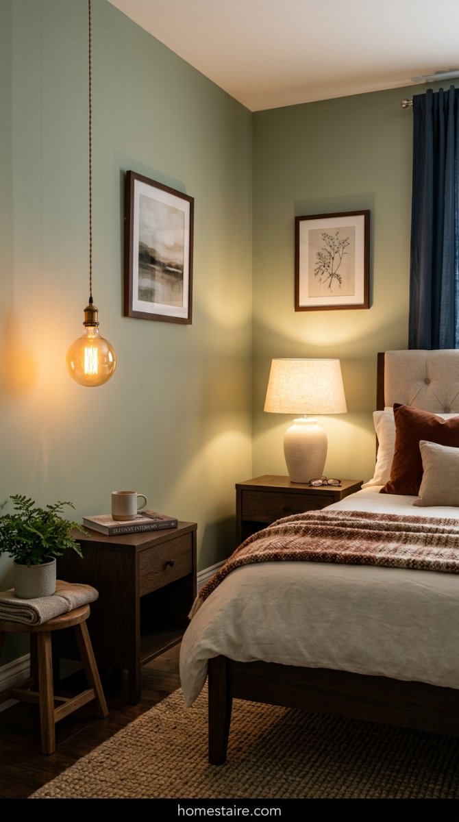
My bedroom looked like a hospital basement at first. I’m not joking. Sage green is a shapeshifter—it absorbs whatever light you throw at it. If you’re using those cold, “daylight” LED bulbs from the grocery store, your walls are going to look like a sickly, muddy gray. It’s depressing.
Swap everything for warm white bulbs (look for 2700K on the box). I went a step further and got amber-tinted Edison bulbs for my bedside lamps. Now, when the sun goes down, the walls literally glow.
Turn off the big overhead light. Just don’t use it. I rely on three different light sources at different heights—a floor lamp, a desk lamp, and some dimmable sconces. It creates shadows and depth. Without it, the green just looks flat.
Indoor plants: How many is too many? (Asking for a friend)
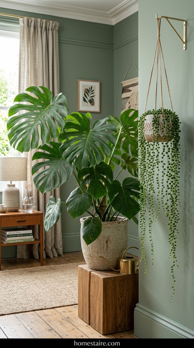
I thought putting green plants against green walls would be overkill. I was wrong. It’s actually the only way to make the room feel “finished.” I currently have seven plants in my room, and I’m eyeing an eighth.
The trick is variety. I have a massive Monstera in the corner with those huge, dark leaves, and then a dainty string-of-pearls trailing off my shelf. The different textures of the leaves break up the solid block of paint. It’s like the walls and the plants are having a conversation.
Seriously. Buy more plants. Even if you kill them (I’ve definitely sent a few ferns to the grave), the vibe they add is worth the ten bucks.
Rugs and textures that make the whole vibe feel soft instead of cold
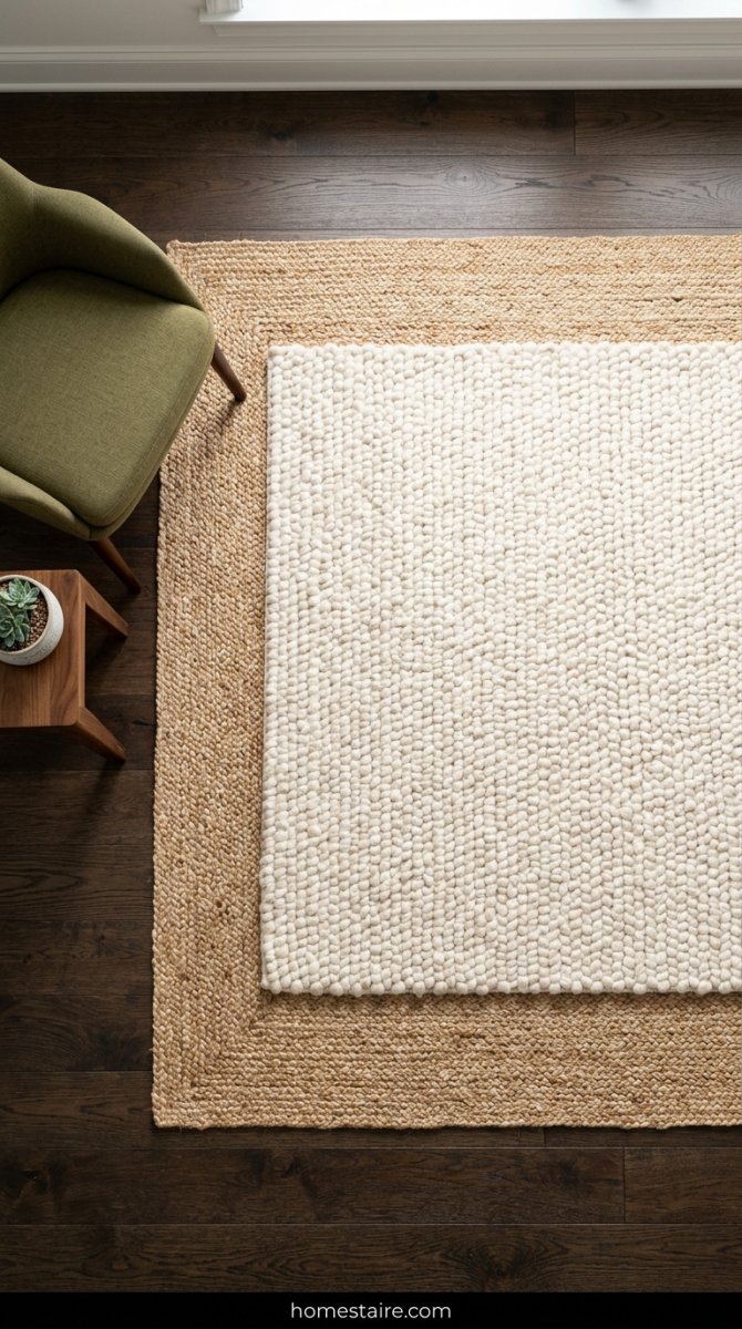
Flat rugs are a trap. I bought a cheap, thin polyester rug because the pattern was cute, and I hated it within a week. It felt scratchy and looked “thin”—if that makes sense? In a green room, you need something that looks like you could sink into it.
I ended up layering a chunky, off-white wool rug over a larger jute one. Is it a pain to vacuum? A little. Does it make me want to never leave my room? Absolutely.
You need that “squish” factor. Sage green can lean a little “cold” if every surface is hard or smooth. I threw a heavy knit blanket over the end of the bed and it immediately fixed the whole energy of the space.
Hardware swaps—ditching the cheap silver for something warmer
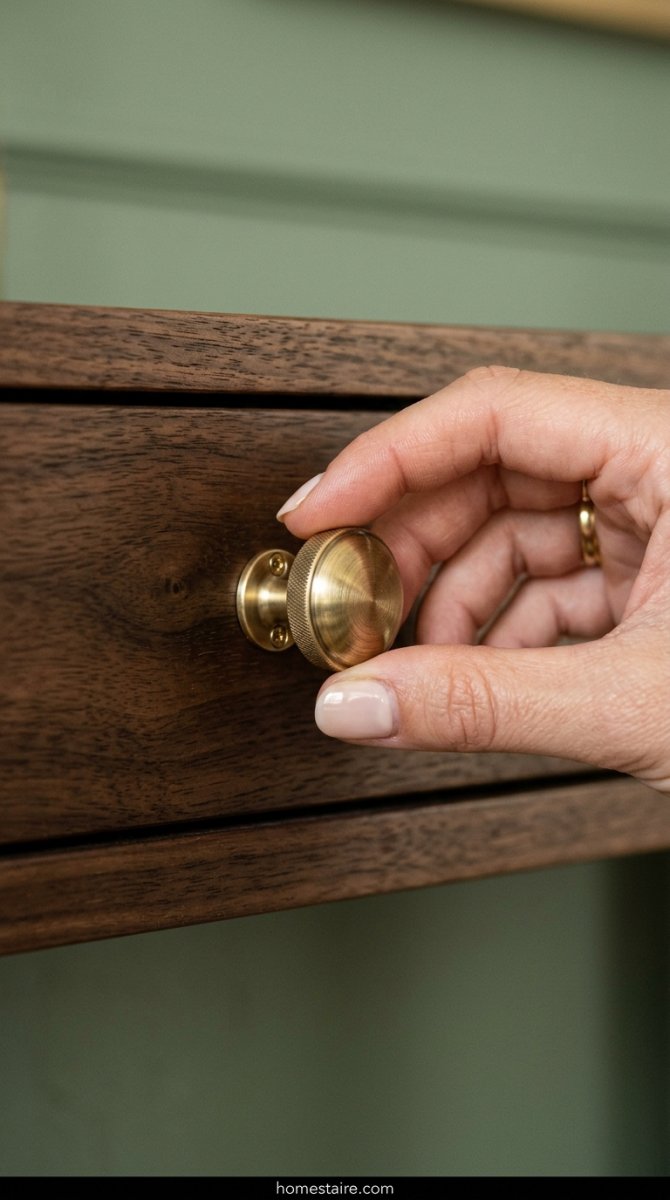
Throw those silver knobs in the trash. I’m dead serious. Silver and sage together give off “1990s dentist office” vibes, and that is not a look.
I spent twenty minutes swapping my basic dresser pulls for brushed brass ones I found on sale. It was such a small change, but it made the green look expensive. It’s like adding jewelry to an outfit.
Gold, brass, or even matte black work wonders. Just stay away from anything shiny and chrome. Why did I wait three years to do this? It cost me twenty dollars and changed the entire mood of my furniture.
Art that actually pops against a green wall
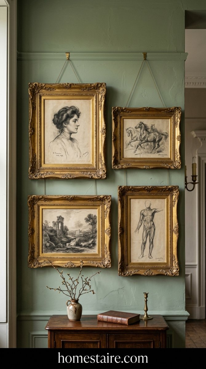
Stop buying green art for green walls. I learned that the hard way. I hung a nature print—yeah, real original—and it just disappeared into the background. My wall looked like a camouflage suit. Total waste of thirty bucks.
Instead, I grabbed some vintage sketches with thick, creamy paper and slapped them in chunky gold frames. The brassy yellow against the sage is a vibe. It feels like a fancy library instead of a kid’s room.
Go for high contrast or don’t bother at all. Deep blacks, charcoal sketches, or even a weird pop of terracotta work wonders. If it’s too matchy-matchy, your eyes won’t have anywhere to land.
Conclusion
Look, I’m not saying a paint color will fix your entire life. That’s a reach.
But waking up in this room feels… different. It’s quiet. My brain stops buzzing the second I walk through the door. It took a lot of trial and error—and a lot of spilled paint on my favorite rug—but I’m obsessed.
Just buy the samples. Paint a big ugly square on your wall and see how it looks at 4 PM. You won’t hate it. Seriously.