I spent six months looking at Pinterest boards of “perfect” kitchens. You know the ones—so white they make your eyes hurt. I wanted that clean, minimalist look so bad, but halfway through the demo, I realized something terrifying. My kitchen was starting to look like a sterile morgue. It was creepy.
I had to pivot fast unless I wanted to feel like I was prepping surgery instead of making tacos.
Minimalism doesn’t have to mean boring. It just means you have to be way more picky about what you actually put in the room. If you don’t add some “grit” to the design, it just feels cold.
Forget the flat white and find some grain
Everyone told me to get those high-gloss white slabs for the cabinets. “They’re so easy to clean!” they said. Liars. Flat white with no soul is how you end up living in a dentist’s office. It’s too much.
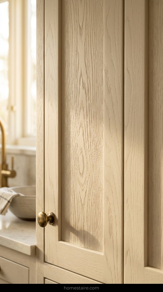
I swapped the upper cabinets for ones that actually show the wood grain through the paint. It’s a tiny detail, but it changes everything. When the sun hits the doors at 4 PM, you see these little ridges and lines that remind you you’re in a house, not a lab.
Texture is the secret sauce. If everything is perfectly smooth, the room feels dead.
Use wood tones to keep things from feeling icy
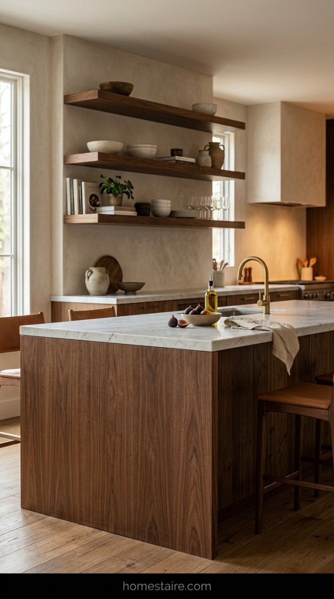
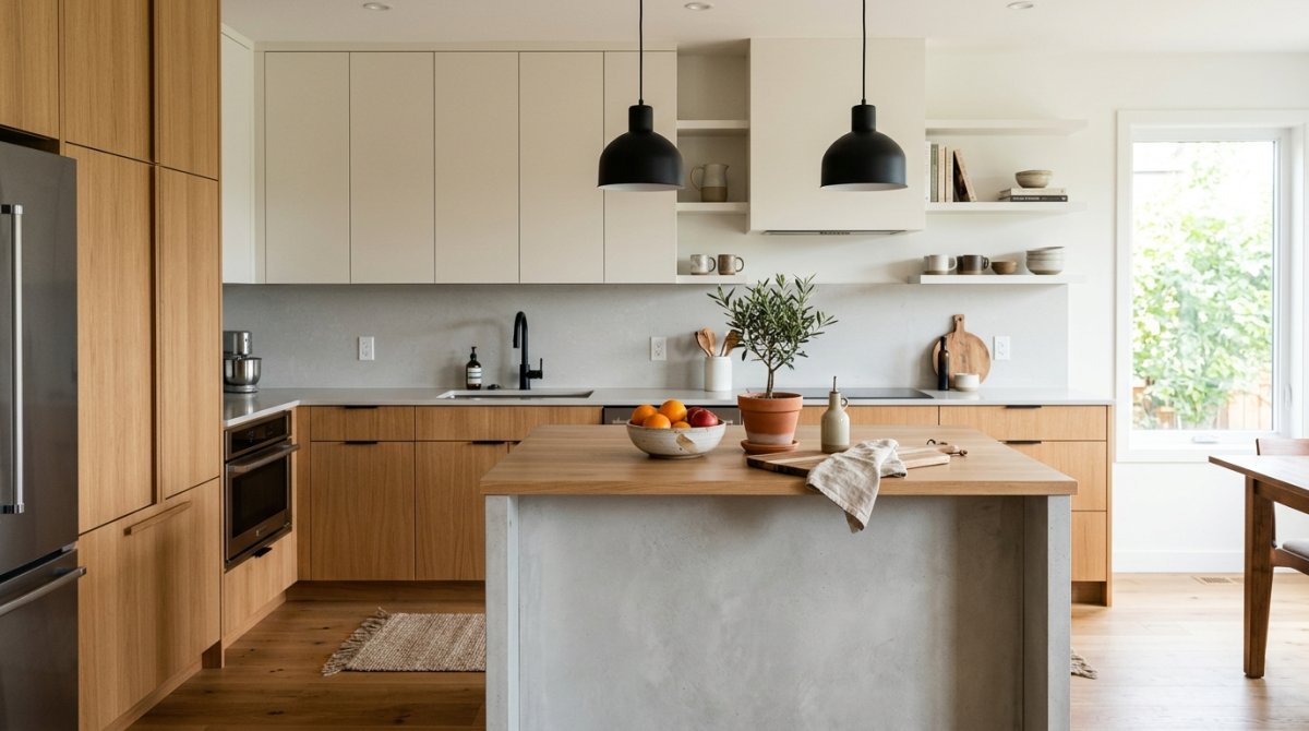
If you go all grey and white, your kitchen will feel like an icebox. Trust me, I almost went there. I ended up grabbing these deep walnut accents for the island and some floating shelves.
Wood is basically a hug for your eyes.
It breaks up the “perfect” look with something natural and slightly messy. I didn’t worry about the wood matching the floor perfectly because that’s another trap. Just pick something that feels heavy and real. I even left a few knots in the wood visible because—get this—nature isn’t perfect.
I went all-in on matte to hide the fingerprints
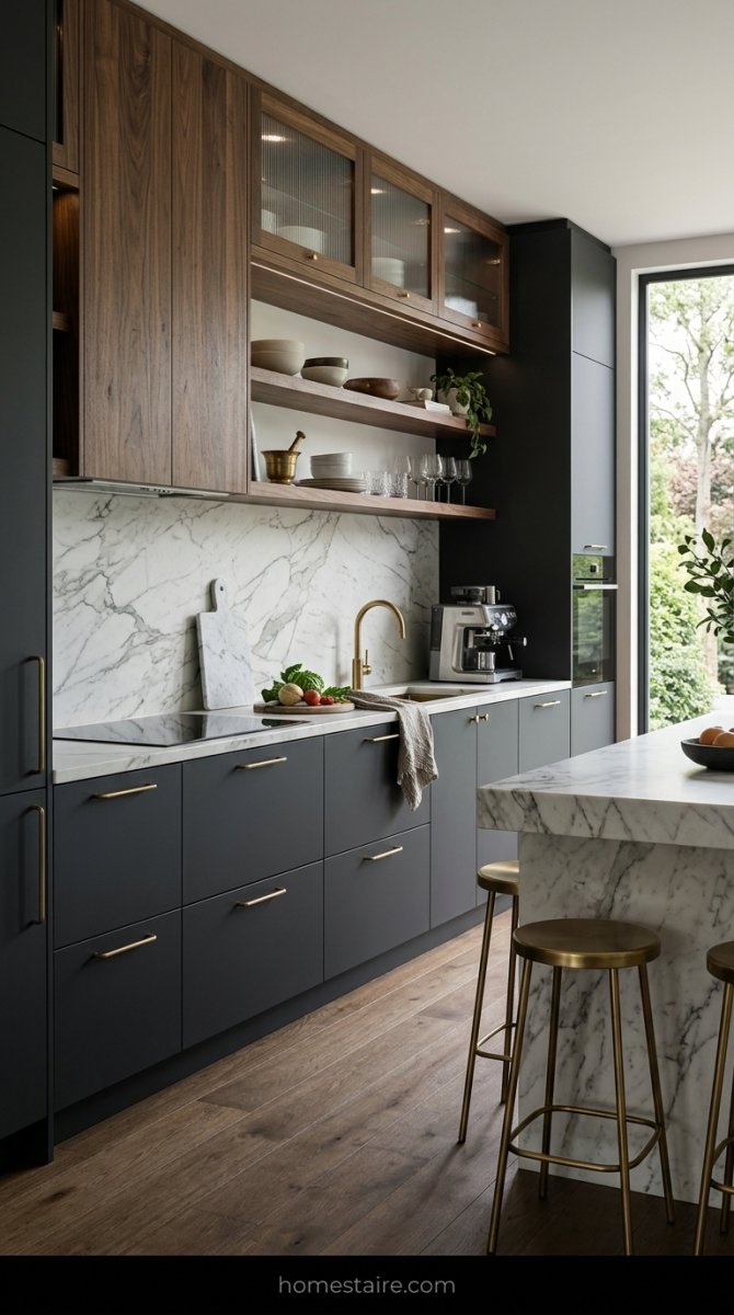
Glossy cabinets are a scam. I said it. If you have kids—or even if you just touch things with your hands—you’ll spend your whole life with a microfiber cloth in your pocket. I switched to a deep matte finish for the lowers.
Zero glare. No greasy smudges. It looks expensive but acts like it doesn’t care.
Seriously.
I chose a dark charcoal for the bottom cabinets. It anchors the room so it doesn’t feel like it’s floating away into a white void. Plus, matte finishes absorb light instead of bouncing it around like a crazy person, which makes the whole vibe way more chill.
Leaving a little room for open shelving saved me
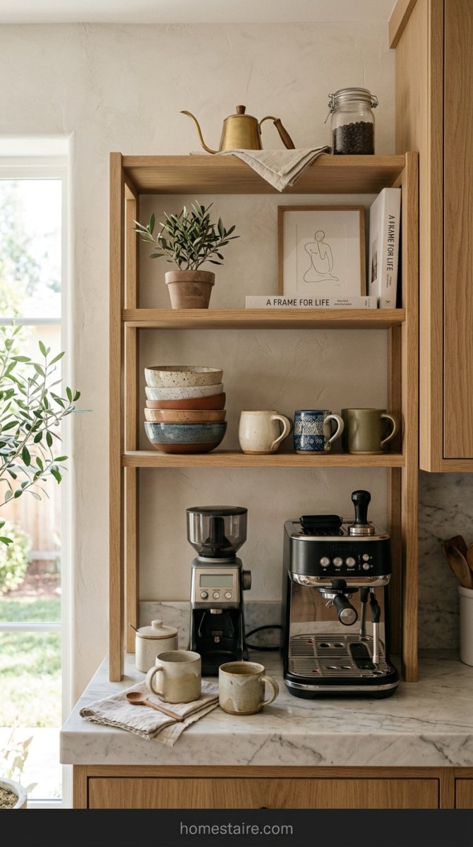
I know, I know. People hate open shelving because of the dust. “Oh, I have to wash my plates twice!” Relax. Having every single thing hidden behind a door made my kitchen feel like a giant, windowless box. I left one small section open near the coffee maker.
It lets the room breathe.
I can actually see my favorite mugs instead of hiding them like they’re some shameful secret. A little bit of “clutter” (the good kind) makes the space feel human. Don’t be afraid to show off a stack of bowls. It’s okay to look like you actually eat in your house.
Why I think handle-less cabinets are a massive mistake
The whole “push-to-open” trend is a lie designed by people who never actually cook dinner. I spent three months obsessed with that perfectly flat, invisible look before I realized I’d be touching the cabinet faces with greasy, onion-covered fingers every single day. Now? I have permanent smudge marks where my kids tried to “pop” the drawer open.
It’s a nightmare to clean.
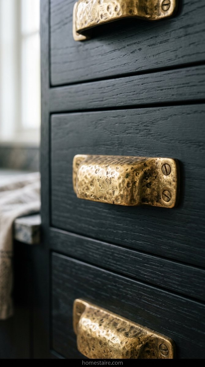
I ended up installing some chunky, textured brass pulls on my lower cabinets just to save my sanity. (And my paint job). If you go handle-less, you’re basically signing up for a second job as a full-time professional glass-cleaner. Don’t do it. Use hardware that feels heavy and real in your hand—it breaks up that scary “wall of white” vibe.
Pick lighting that looks like art, not a surgery lamp
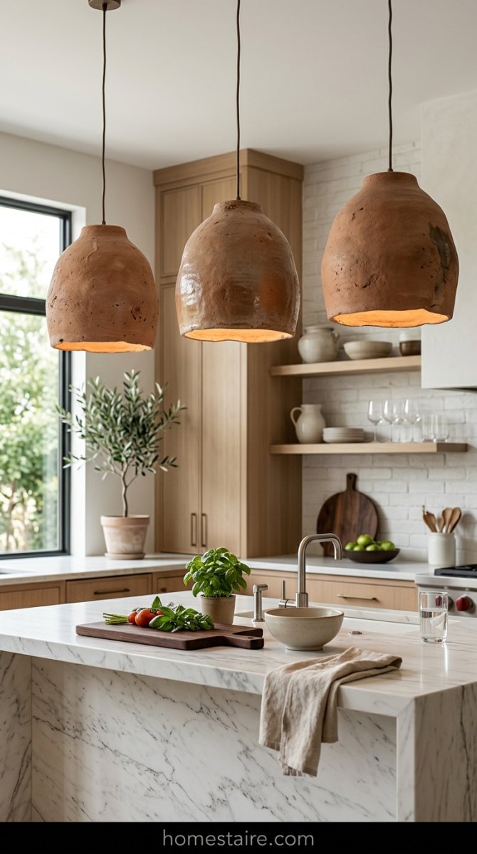
If your kitchen makes you feel like you’re about to have an appendectomy, your lights are too cold. I see these modern builds with those blindingly white LED recessed cans and I just want to hand out sunglasses. It’s way too clinical.
I swapped my basic fixtures for these weird, oversized clay pendants that look more like something you’d find in a pottery studio than a hardware store.
They don’t match anything perfectly. That’s why they work. Go for warm bulbs—nothing over 3000K—and find a shape that looks “handmade” rather than “factory-produced.” It makes the room feel like a home instead of a laboratory.
Stick some greenery in the corners to add life
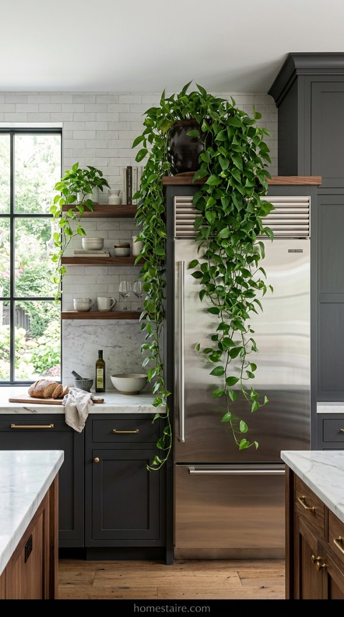
I am a notorious plant murderer, but even I know a minimalist kitchen needs something that breathes. Without a bit of green, the straight lines and hard angles feel aggressive. I bought a giant Pothos and shoved it on top of my fridge where it can just drape down like a jungle vine.
It hides the dust.
More importantly, it softens those sharp corners that make modern kitchens feel so stiff. If you’re scared of killing things, just buy a bunch of those cheap eucalyptus branches from the grocery store and stick them in a heavy vase. They dry out and still look cool—no water or talent required.
My kitchen rug is the only thing that’s soft
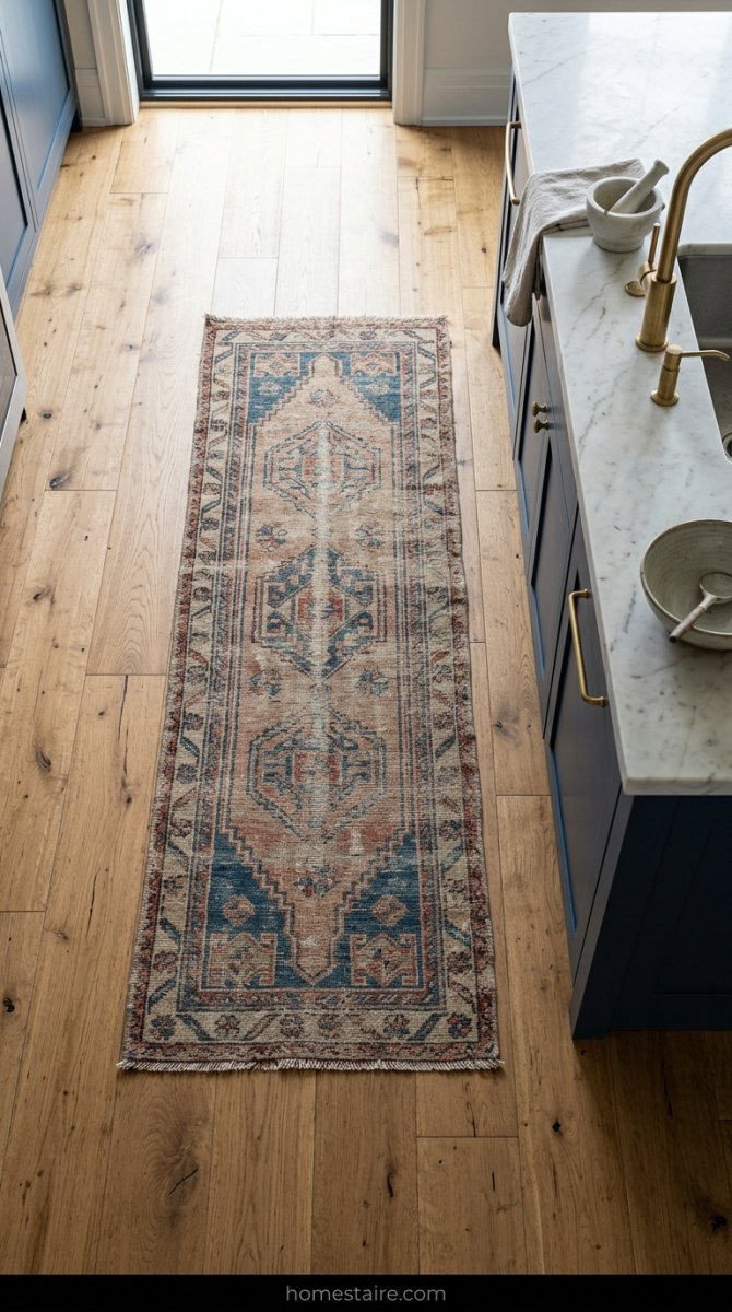
Minimalism hates texture, but my knees love it. Standing on hard tile or polished concrete for an hour while you prep meal-kit boxes is a recipe for a bad back. I ignored the “no rugs in the kitchen” rule and bought a vintage-looking runner that’s basically a glorified blanket for the floor.
Yes, I drop sauce on it sometimes.
Who cares? I just spot-clean it and move on. That single piece of fabric stops the room from echoing like a cave and gives your eyes something to look at besides endless flat surfaces. It’s the easiest way to “humanize” a space that feels too sterile.
Keep the things you use every day out on the counter
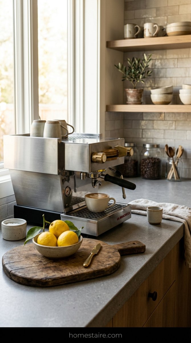
The “clear counter” lie is the fastest way to make your house feel like a model home that nobody actually loves. I used to hide my toaster and my heavy wood cutting board every morning. It was a massive waste of time.
Now, I keep my ugly-but-amazing espresso machine and a bowl of lemons right out in the open.
Seeing a stack of salt cellars or a bowl of fruit tells people that—hey!—a person actually eats here. It adds “visual clutter” in the best way possible. If every single surface is empty, the room looks dead. Leave the stuff you love out. It’s fine. Seriously.
Pick a backsplash with some actual movement in it
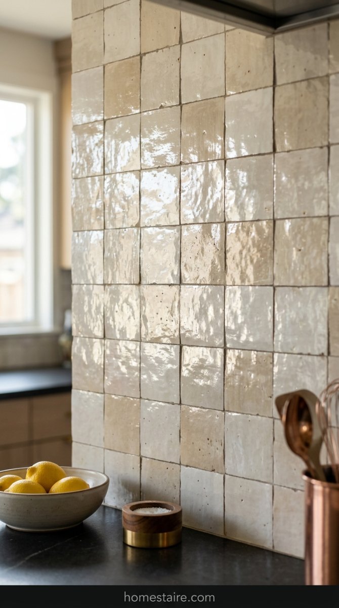
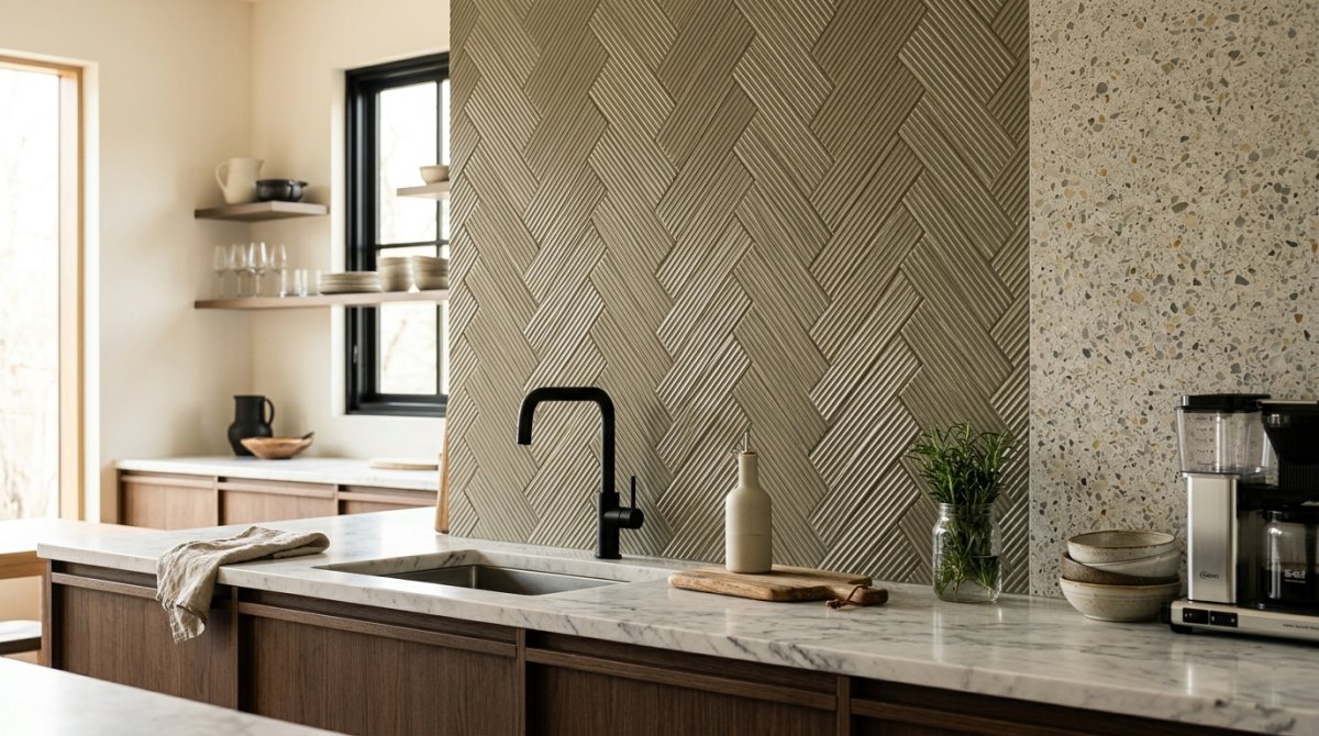
I almost went with the basic $1-a-square-foot white subway tile because I was being cheap. Big mistake. That stuff is exactly why minimalist kitchens end up looking like an ER waiting room. I ended up grabbing some Zellige-style tiles that are slightly “wonky” and uneven.
The edges aren’t perfect. Some are a bit thicker than others. When the sun hits them late in the afternoon? It’s pure magic. It breaks up that flat, boring wall without adding actual clutter.
If your backsplash looks like a perfect spreadsheet, you’ve already lost the battle.
Conclusion
Listen, I love a clean house as much as the next person, but I’m a human who lives here. Not a robot. My kitchen needs to be a spot where I can burn toast and spill red wine without feeling like I’m ruining a museum exhibit.
If you make your space too perfect, you’ll be terrified to actually use it. That’s a miserable way to live. Stick to the wood tones, the weird art-y lights, and the “messy” tiles.
You’ll thank me when you aren’t shivering in your own breakfast nook. Seriously.